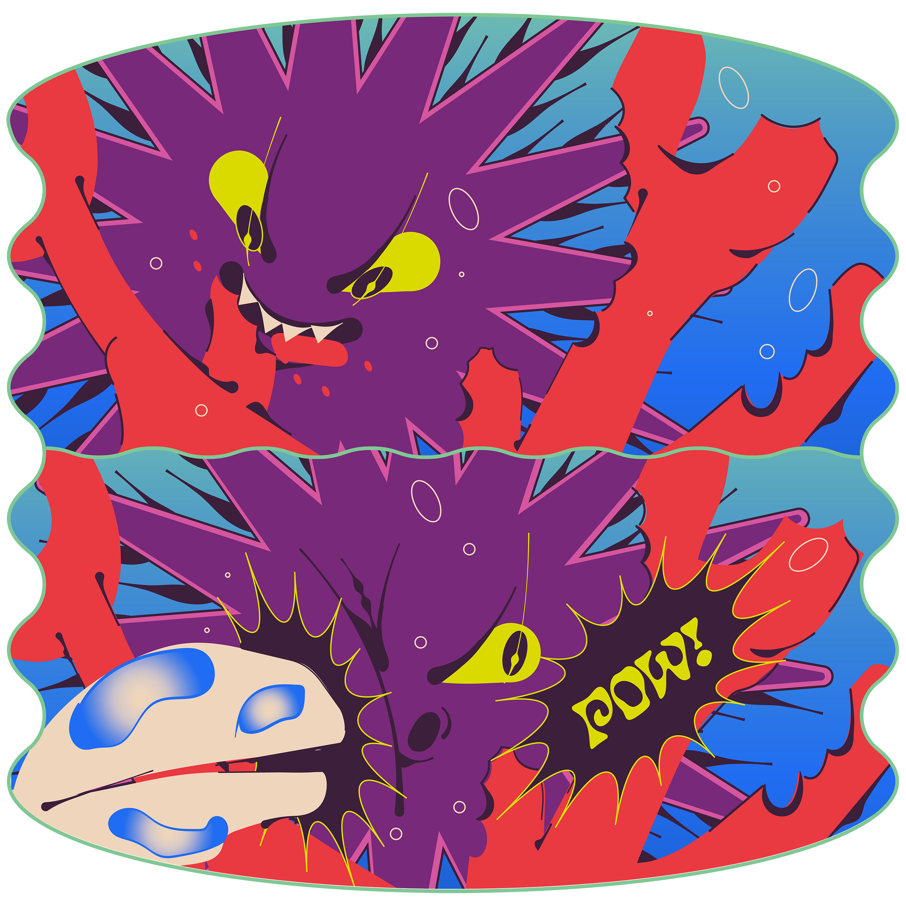
As part of a collaboration between It’s Nice That and conservation organisation On the Edge, we co-commissioned a series of comics that explore vulnerable species around the world currently in the fight for survival. These comics have been created by artists Min Heo, Cory Feder, Jer Dee and María Medem.
On the Edge is a team of storytellers and scientists on a mission to emotionally reconnect us with nature. As they see it, humanity has become detached from the natural world, and as a result is largely unmoved by its ongoing destruction. Following a similar approach, our commissioned artists have illustrated the plight of four different species that without our attention, could also go unseen.
My role - Creative Lead at It’s Nice That
Additional credits:
Identity Design - Ciaran Birch
Writer - Daniel Milroy Maher
Project Manager - Lucy Orr
Full article on itsnicethat.com

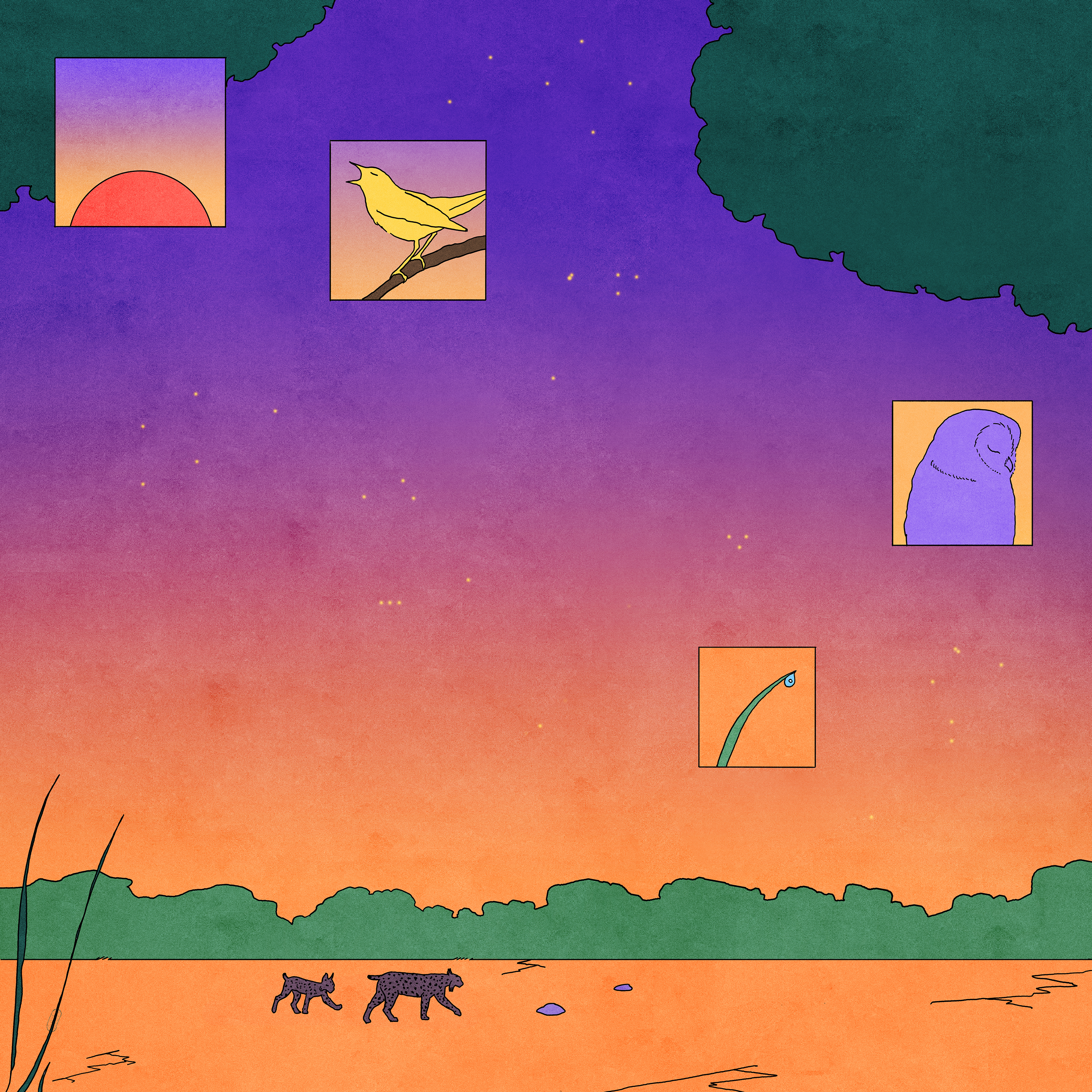
Desert Rain Frog by Min Heo
“Like many people on the internet, I was immediately charmed by the Desert Rain Frog’s cute but grumpy appearance,” says Min Heo. “However, learning more about its story saddened me… We are oblivious to the fact that we are destroying its home and environment through human behaviour.” In Min’s comic, we see the rotund figure of the frog staring into a mirror, dreaming of clean sandy shores, fresh air and an abundance of bugs to eat. However, after emerging from its home in the dunes, the reality it faces is very different.


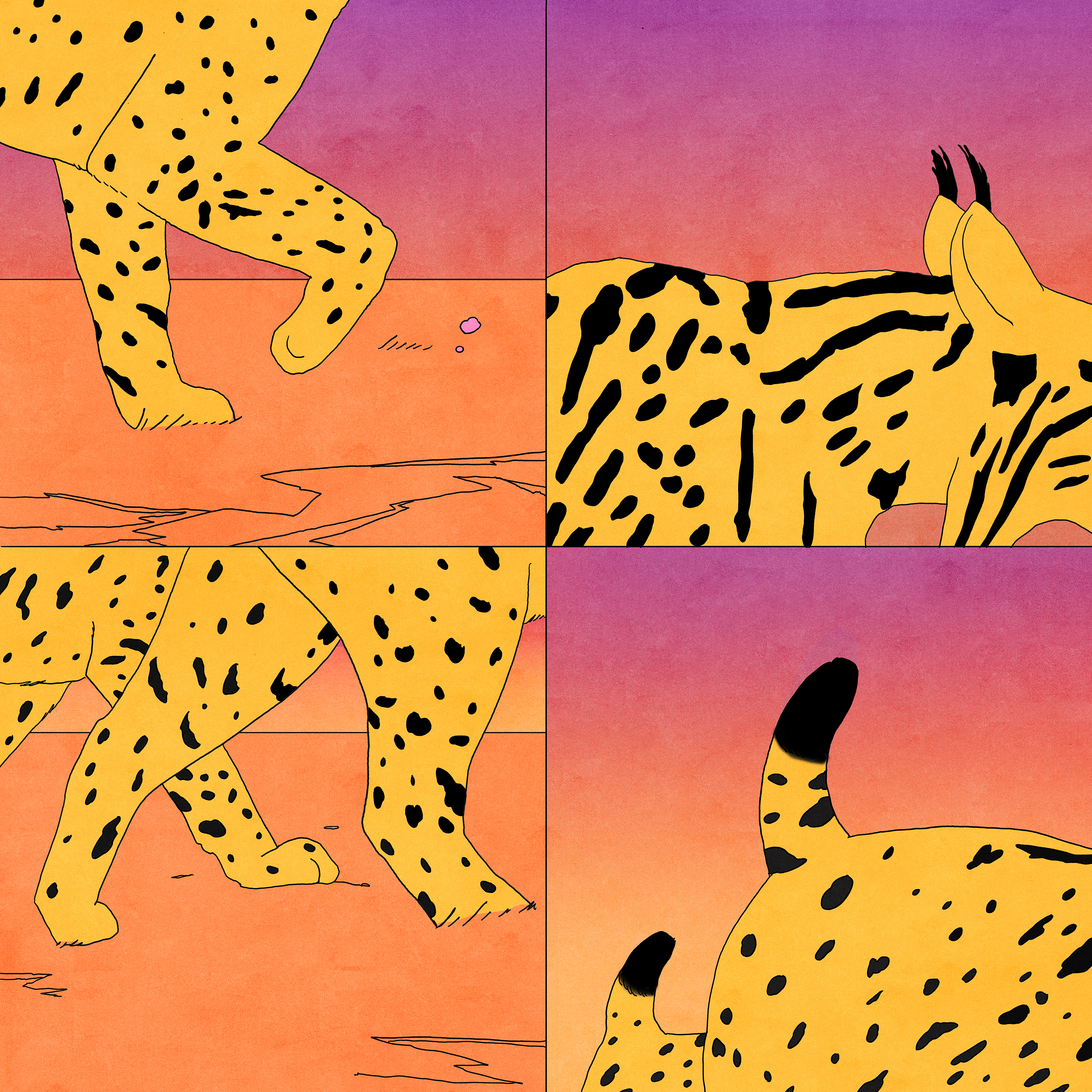
Iberian Lynx by María Medem
Local Andalusian artist María Medem remembers learning about the Iberian Lynx as a child, when, after watching several documentaries and discussing it in school, she became “extremely sad” about its predicament. “I couldn’t read or watch any news about the Lynx, because I wanted to cry,” she recalls. “I remember clearly thinking that I didn’t want to live in a world without them.”
In María’s comic, the problems facing the Iberian Lynx and its home are clear. We follow a mother and cub as they traverse the vast landscapes of Doñana in search of water and food. Rendered in María’s moody colour palette and soft textures, the national park seems like paradise, but reality sets in as we watch the lynxes encounter various man-made structures that are interfering with the ecosystem, draining precious water away from the land.


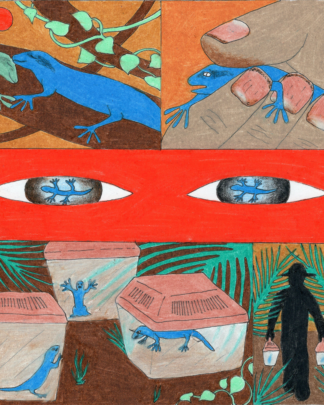
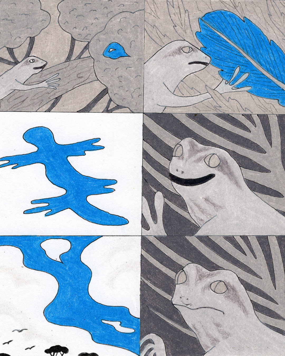
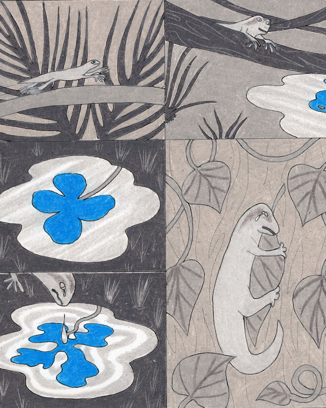
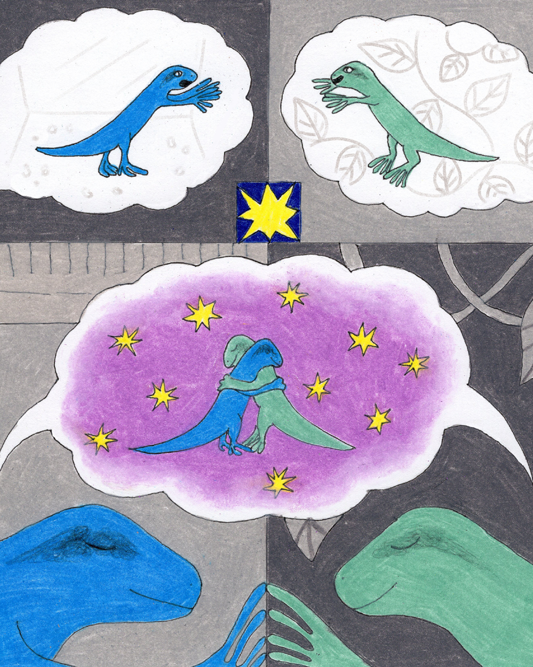
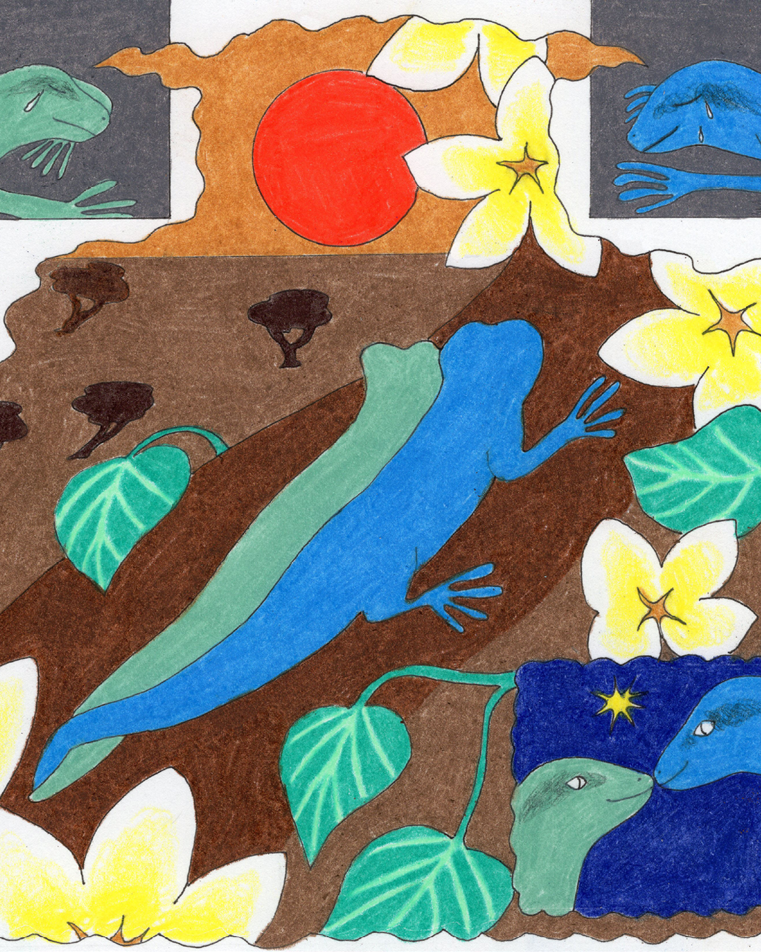
Blue Gecko by Cory Feder
The Electric Blue Gecko is another small reptile, but its most eye-catching feature is the male’s electric-blue skin. As a result of its striking appearance, it has become a highly sought-after species in the exotic pet trade, frequently taken from where it lives in the Kimboza and Ruvu Forests. In fact, 15 per cent of the Electric Blue Gecko population was illegally collected for the pet trade between 2005 and 2009 alone.
“I felt so many emotions reading through the story and thinking about the relationships between Electric Blue Geckos that are interrupted by forced relocation,” says Cory Feder, the artist behind the comic. “I thought it was so relatable, as forced migration and relocation are large parts of human history, and the loss of relationships and land is heartbreaking.” In her comic, Cory wanted to emphasise these emotions, choosing to visually anthropomorphise the Electric Blue Gecko by depicting it smiling, frowning and crying.

Harlequinn Shrimp by Jer Dee
Found in the tropical Indian and Pacific Oceans, the Harlequin Shrimp is a colourful crustacean whose body patterns appear in blue, purple, red and other vibrant hues. Flamboyant though they may be, these shrimps are surprisingly effective hunters, feeding exclusively on starfish that they find in their coral reef homes. This is bad news for their prey, but good news for the environment, as outbreaks of starfish, such as the Crown-of-Thorn's starfish, have been shown to have devastating effects on coral reefs, as they munch away, endangering many species.
Based in Manila, illustrator Jer Dee lives not far away from the Shrimp’s own home, and he says this was an exciting discovery. “I found it fascinating that a shrimp like that exists and that it can be found in the Philippines. Its role in the ecosystem also piqued my interest, and the fact that, despite its size, it is able to hunt prey much bigger than itself and protect the reefs at the same time.”


The identity design allowed for each comic to have it's own colour palette, to reflect the natural environment. The comics were also shared on Instagram and TikTok lending themselves well to the carousel format.


Music Video for WELLL
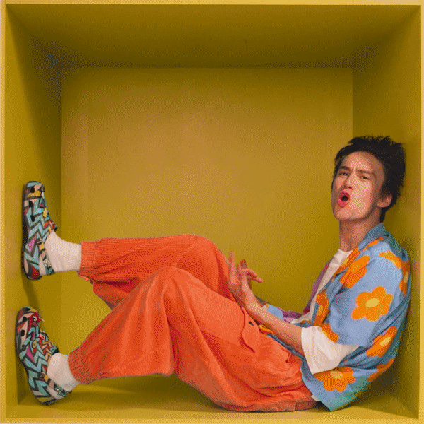
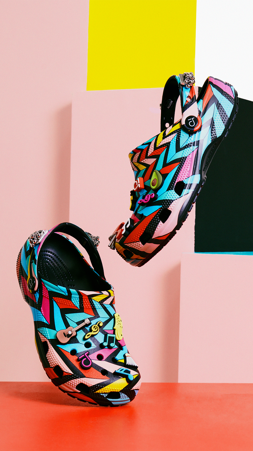
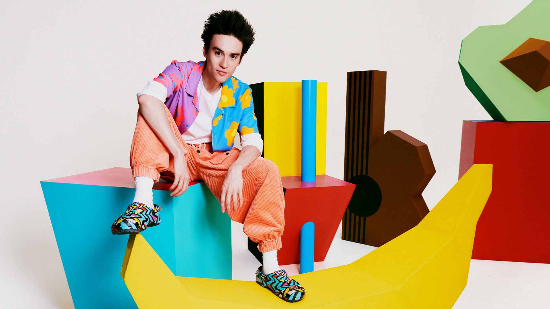
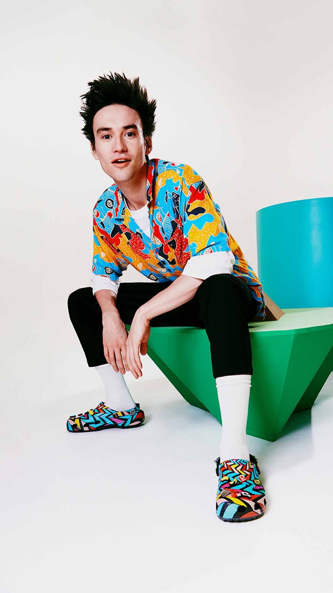
Crocs - Jacob Collier Collab
Jacob Collier is a multi Grammy-winning vocalist and multi-instrumentalist musical genius. And most importantly he is obsessed with Crocs!
This collaboration sees Jacob work together with Crocs to create a limited edition musical shoe with tambourines on the heel strap and playable Jibbitz. Music is made with each step you take!
To celebrate the launch of the Crocs we created a music video for his track ‘WELLLL’, inspired by the patterns on his shoes. We step into Jacob’s colourful multiverse world and watch a performance that happens inside his Crocs. Yes, really! Also, we created cutdowns, stills, a musical duet challenge and a teasing phase for Instagram and TikTok.
My role - Art direction & Creative at Hey Honey
Additional credits:
Copy writer - Ioana Iancu
Account managers - Céline Boubekri & Liam Hesketh
Producer - Morgan Beattie & Léa Enghelabi
Director - Mike Harvey
Photographer - Jackson Bowley
Set Design - Gemma Tickle

Lifestyle stills
Hero film
Teaser visual
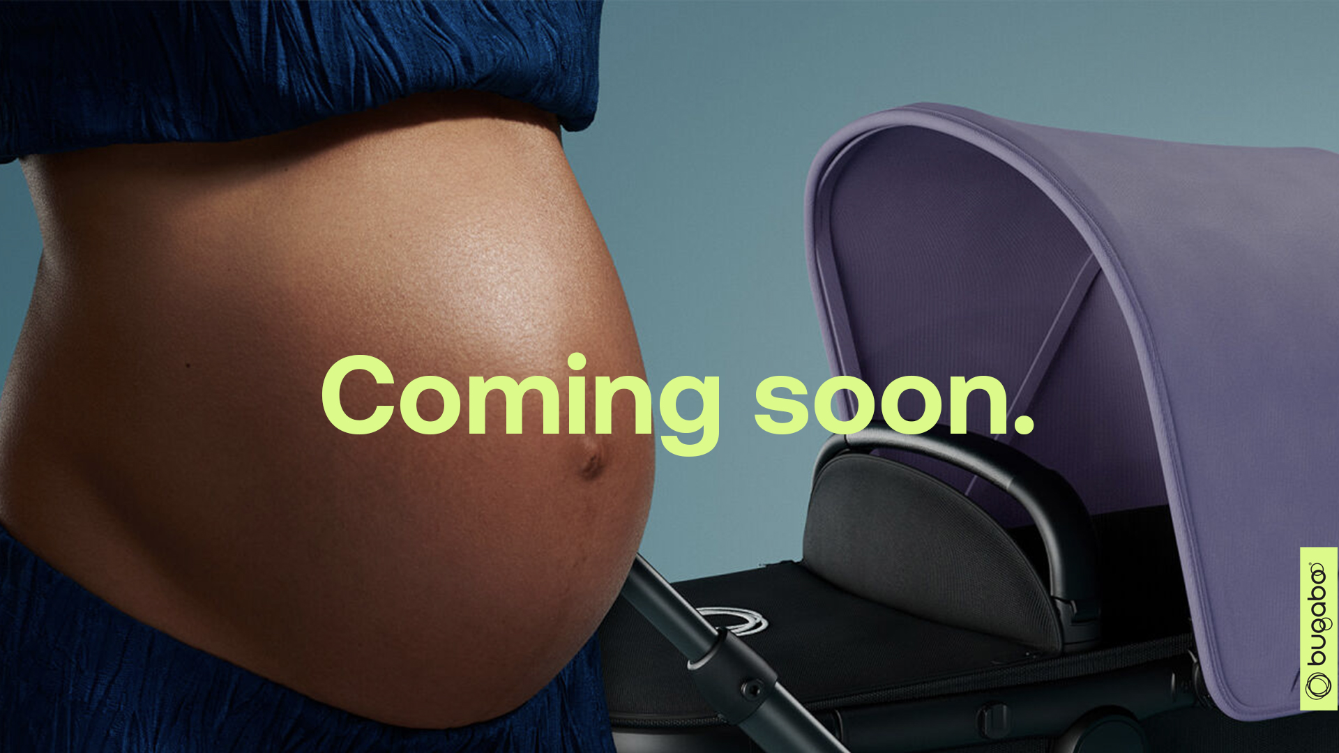
Bugaboo Fox 5 - The Beauty of the Bump
The pregnant belly is perfectly engineered by nature; it’s warm, safe, and ultra-comfortable – just like the Bugaboo Fox 5. Of course, nothing can compete with nature and the growth of a beautiful human body, so the stroller is positioned not as an upgrade to carrying a baby inside a bump, but as ‘the next best way to carry your baby.’
This global campaign allows the brand to pay homage to the amazing human body and the incredible process of pregnancy. It is a self-effacing and unexpected brand stance that expectant mothers can get behind – making them feel understood and celebrated.
A hero film, technical product cut downs and lifestyle photography were created for this project,
My role - Art direction at HALAL Studios
Additional credits:
Creative direction - Pascal Duval
Copy writing - Alex Rigby
Art direction - Noemi Tombeur and I
Account & production - Manon Patty & Caroline Hagoort
Production company - HALAL
(Comfort & suspension, maneuverability and one hand control)


Lifestyle stills


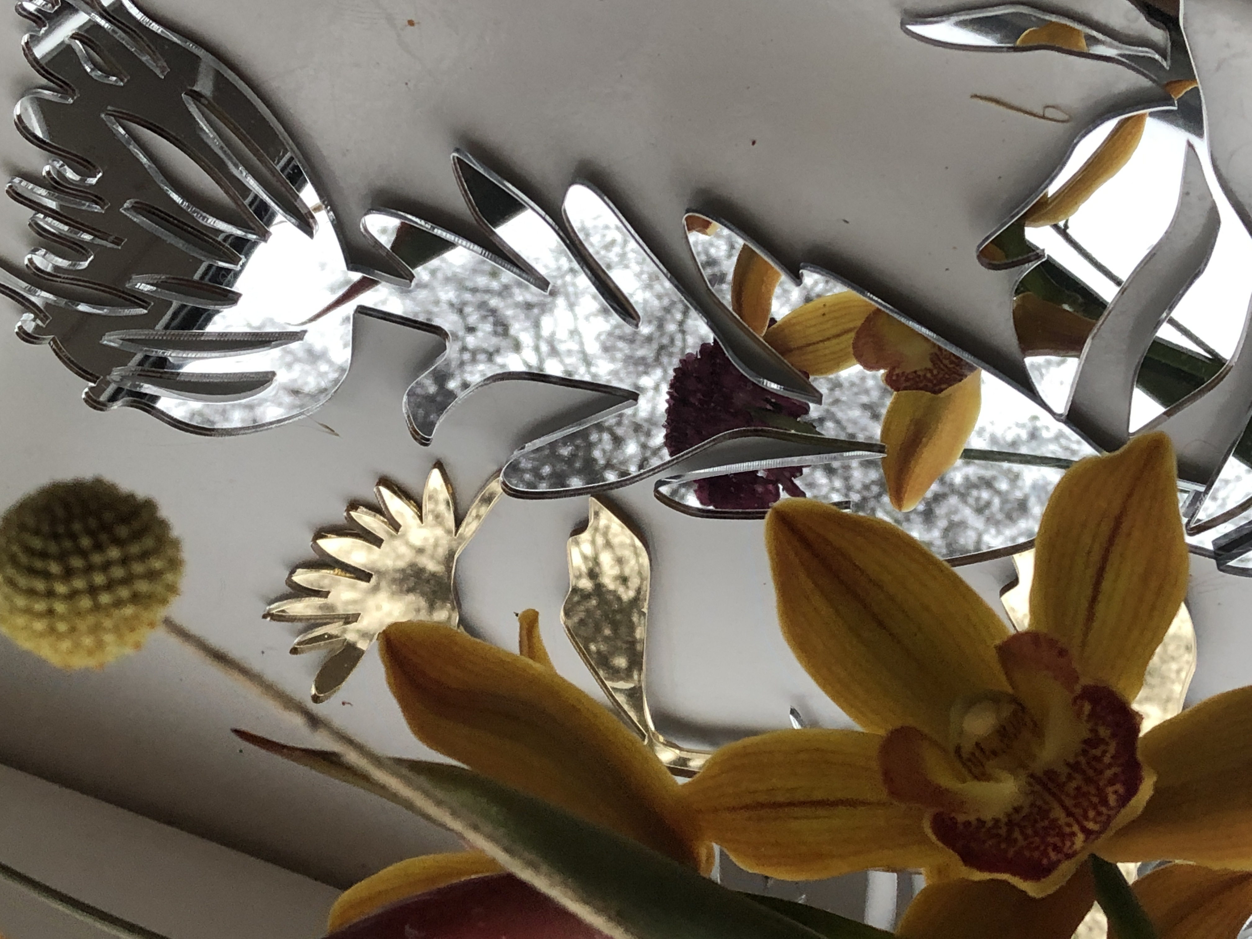
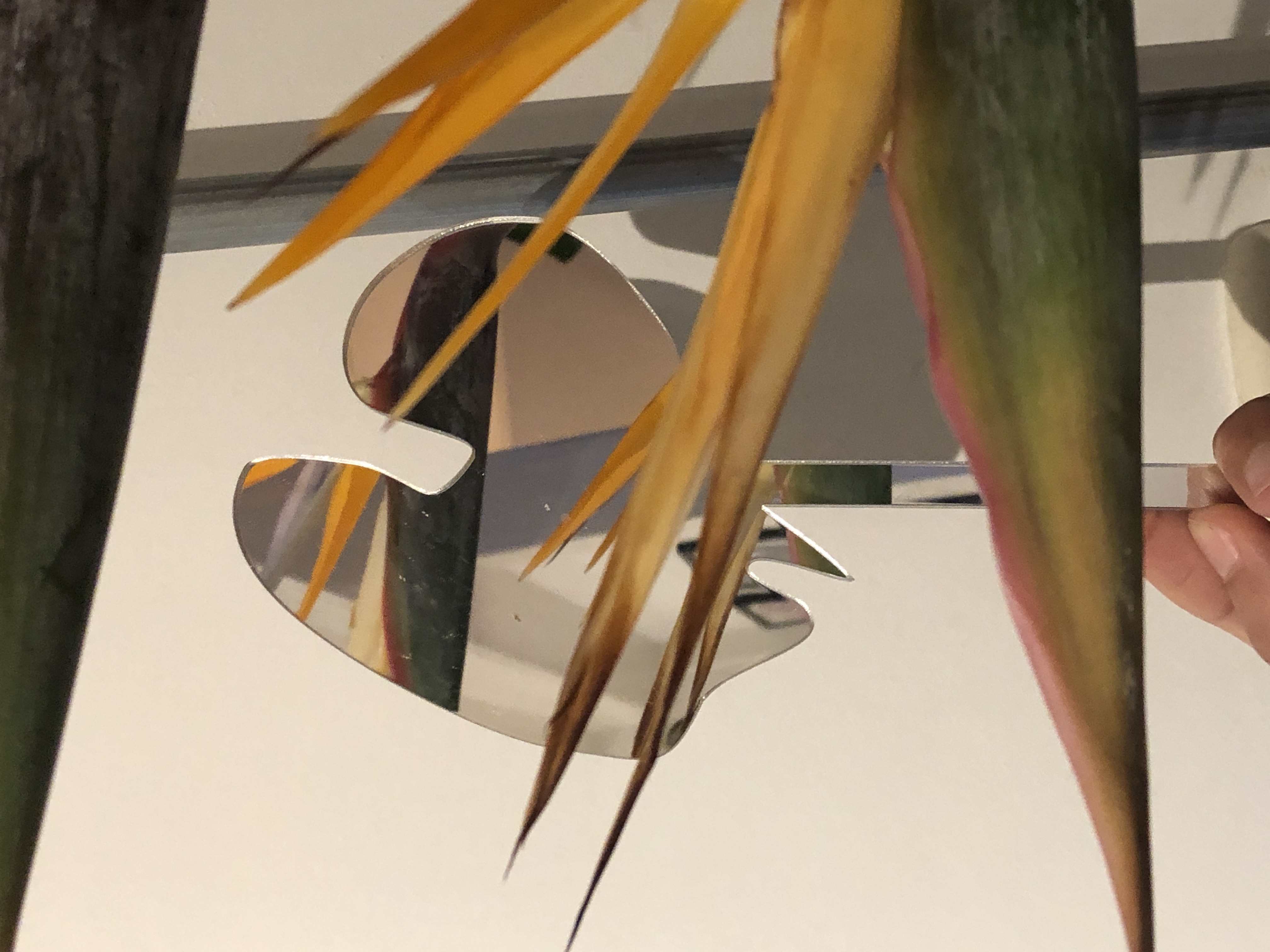
Flowers Arranged
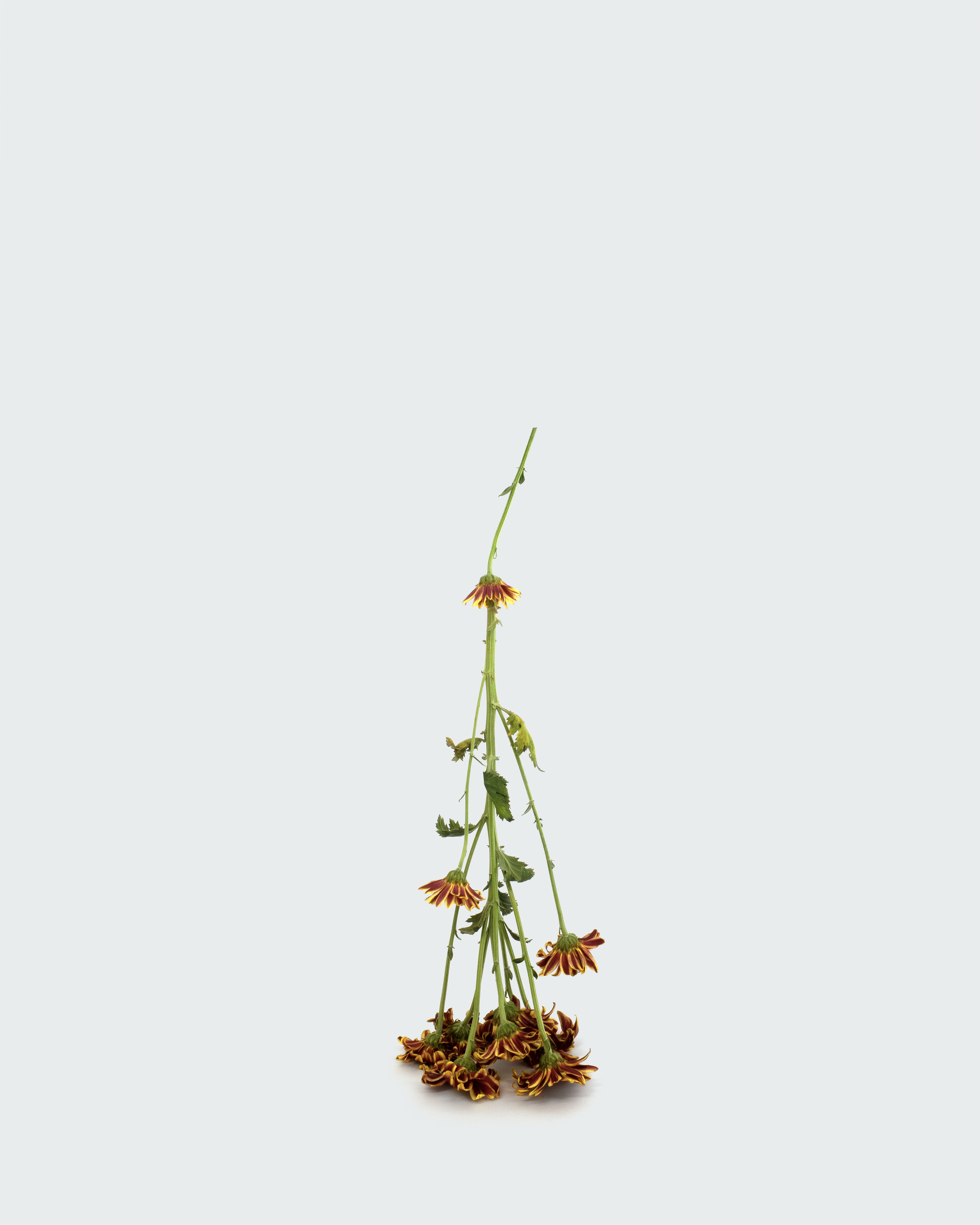
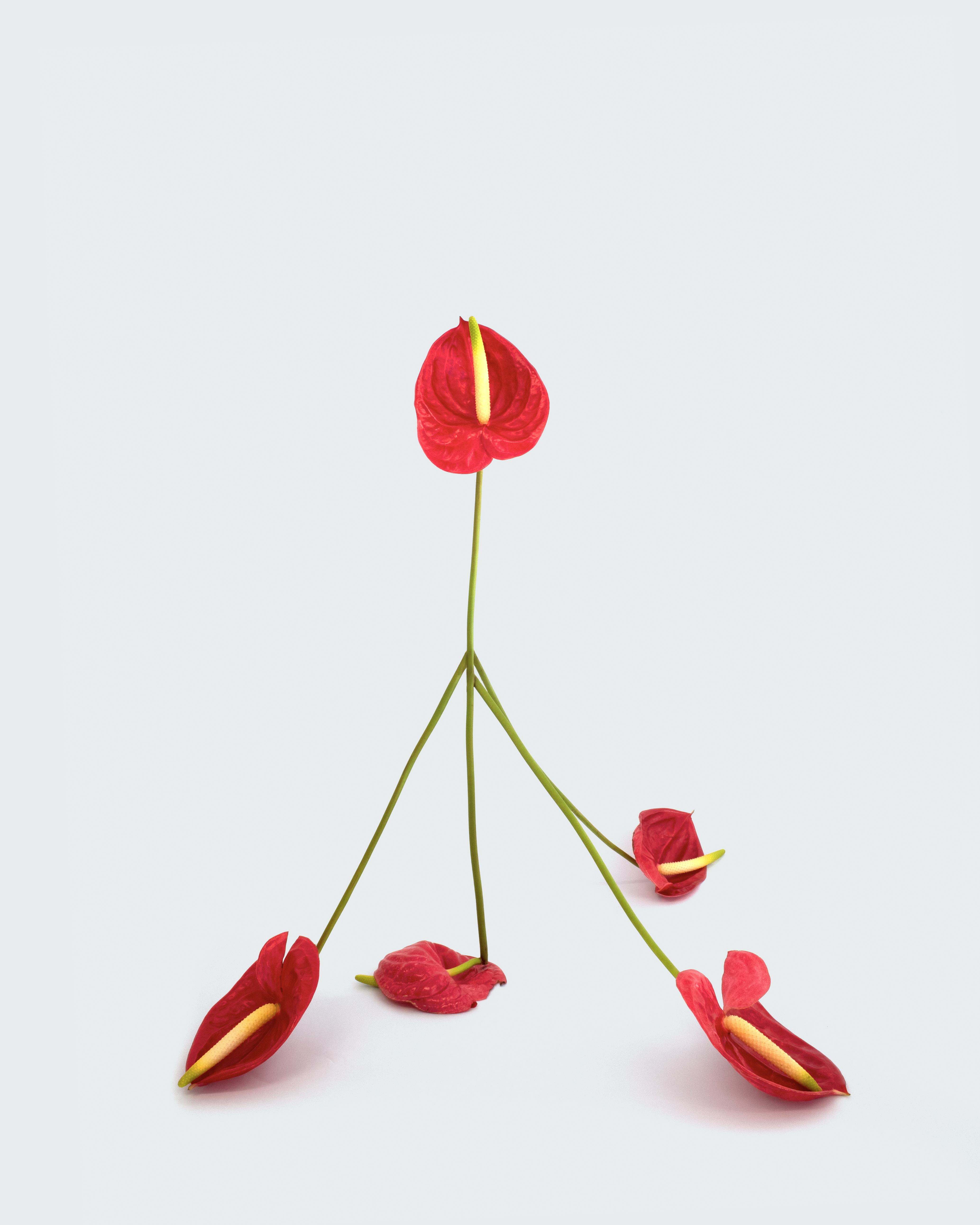
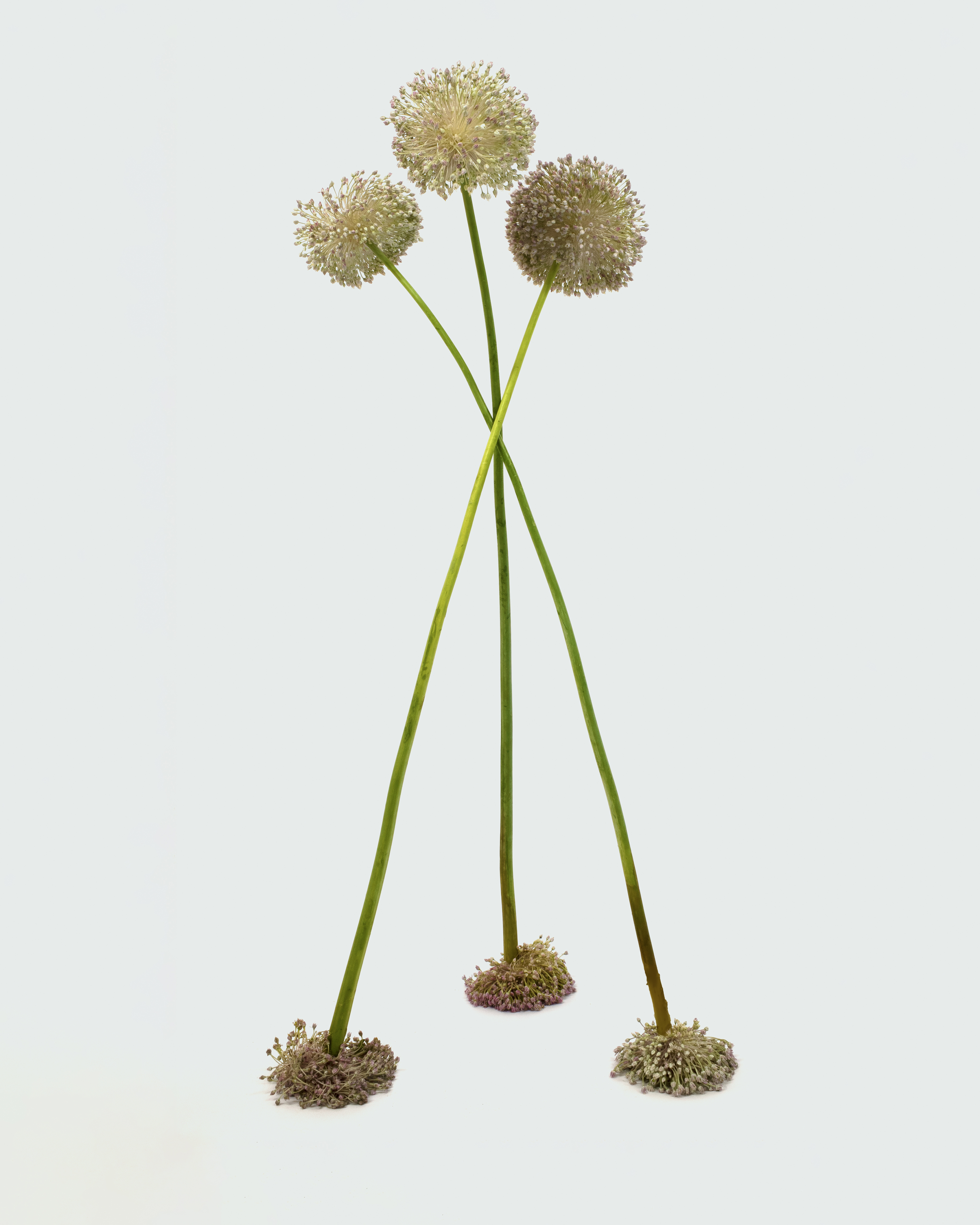
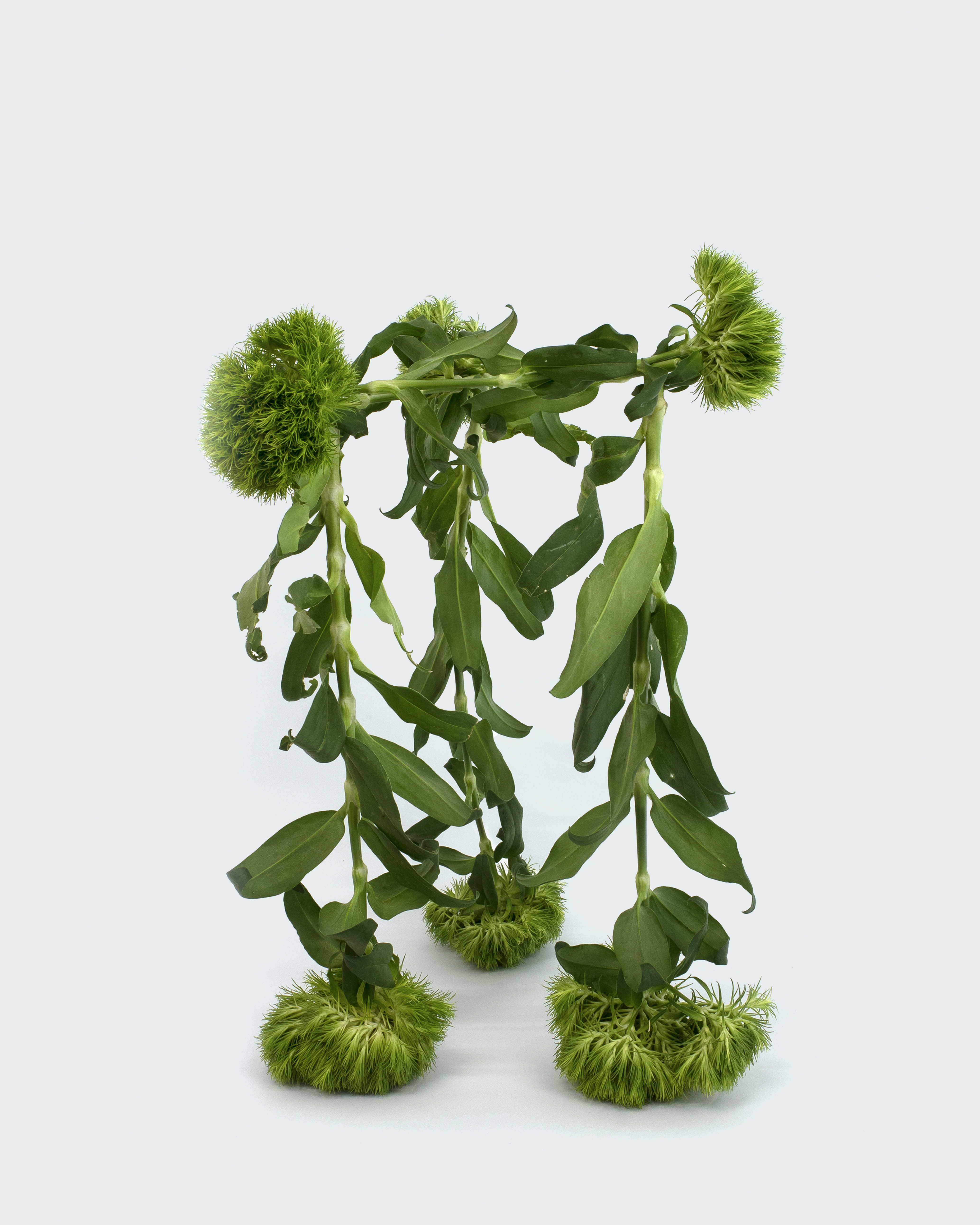
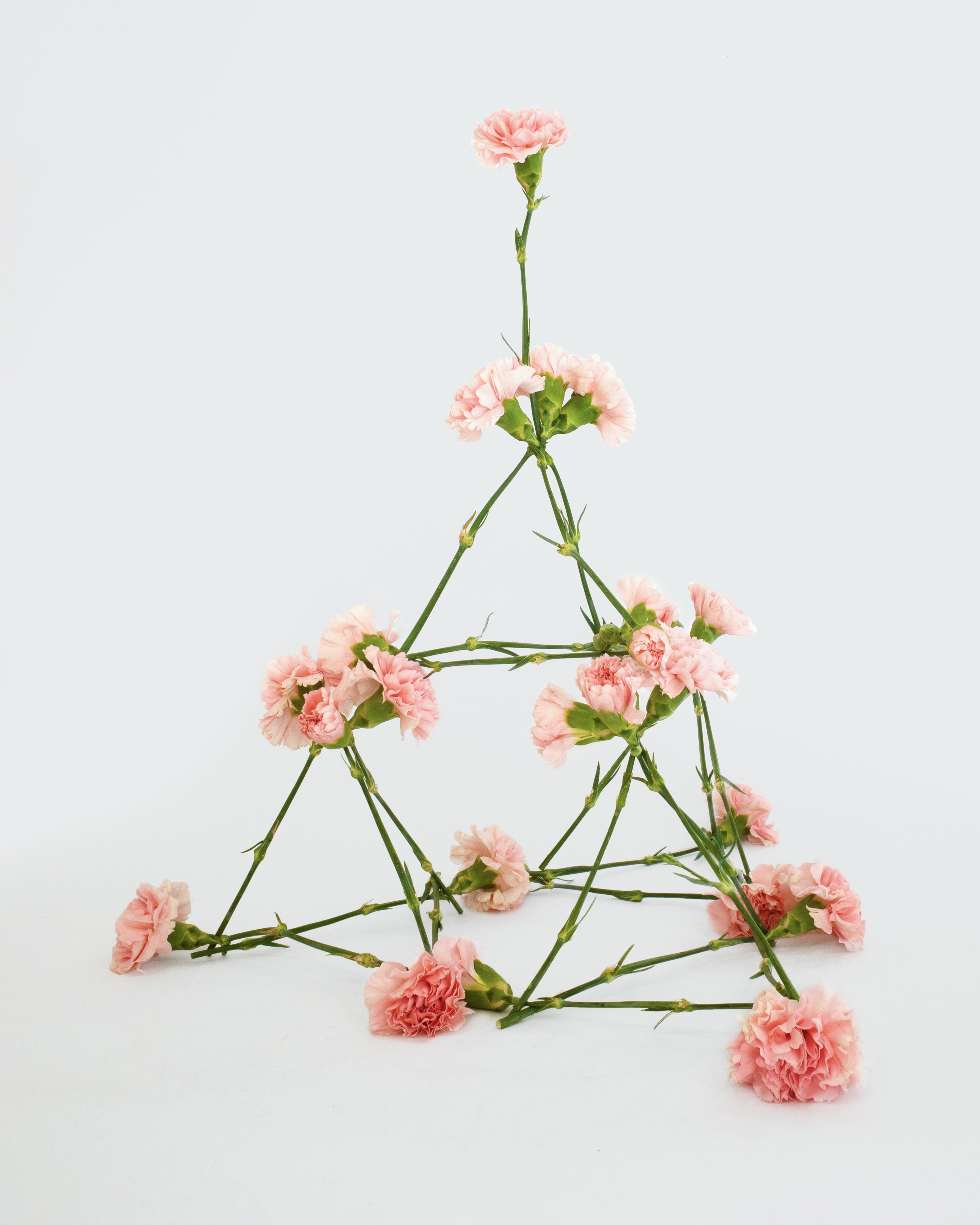
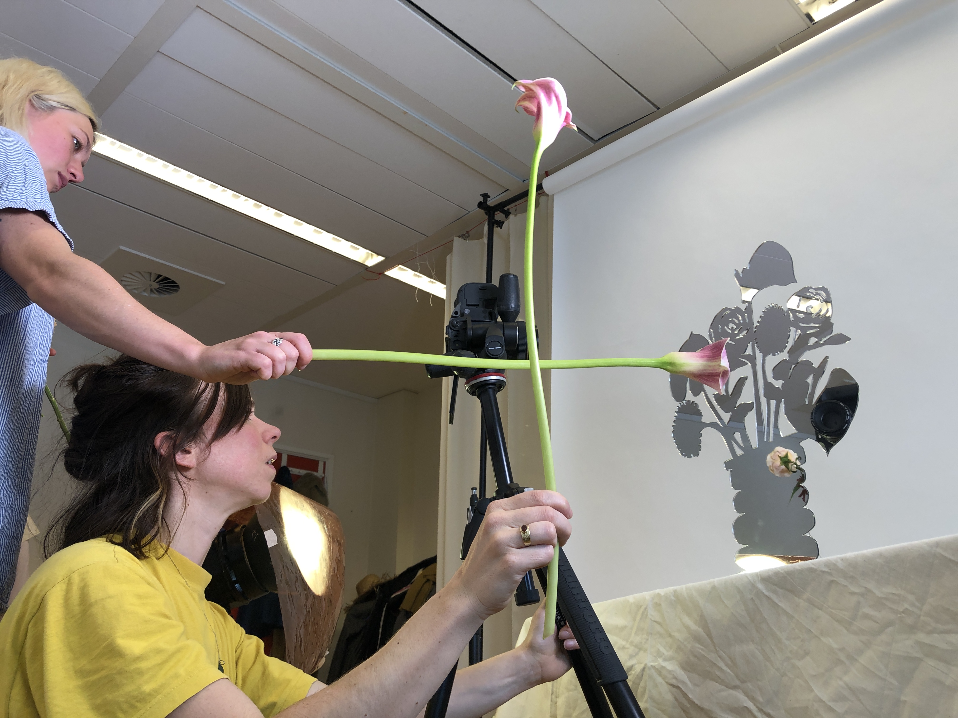
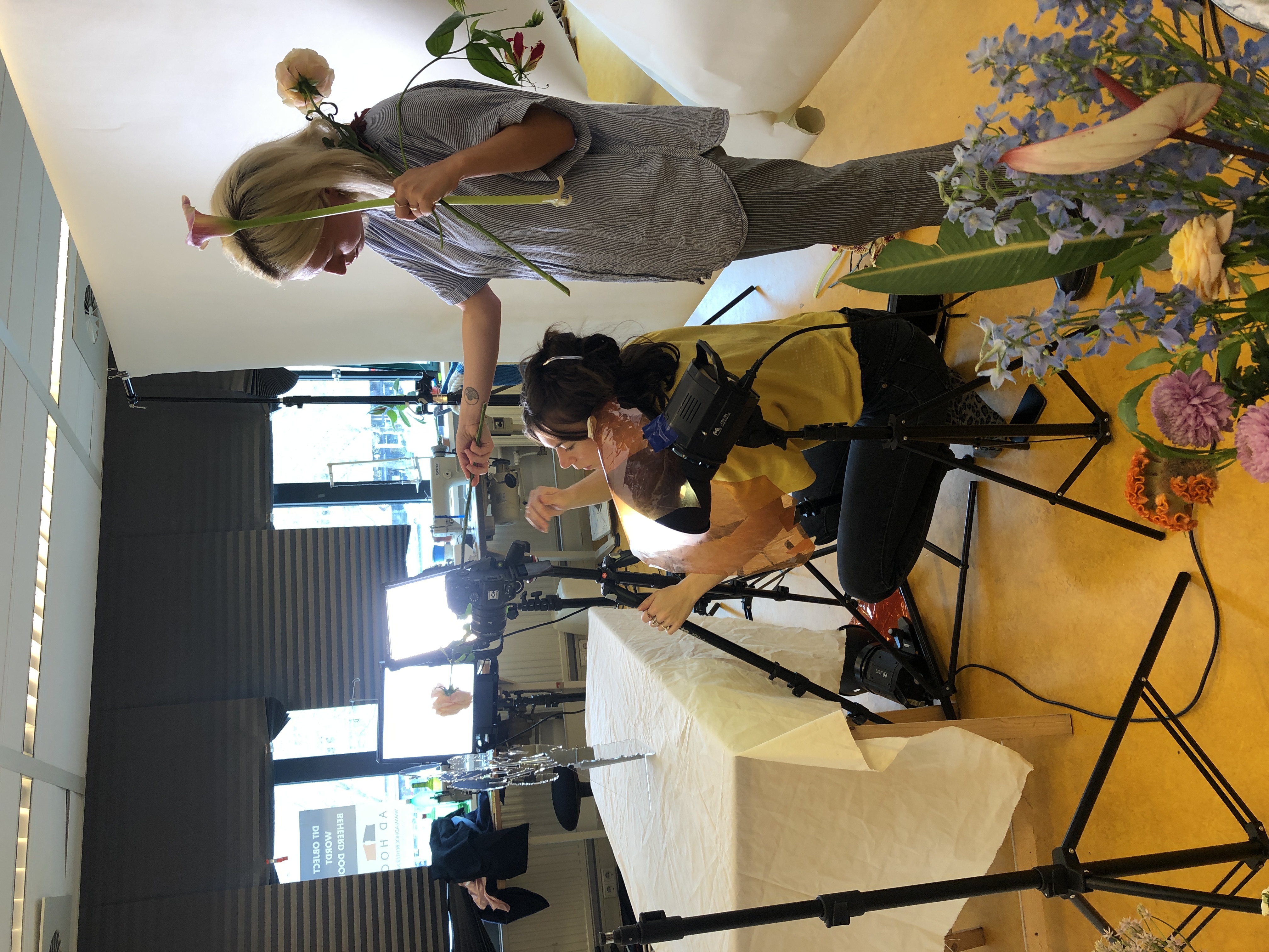
This project was the result of a six weeks artists residency at Casa Lü, Mexico City. My photographs and sculptures were part of the exhibition INSTABLE, April 2023.
Flower arranging traditionally follows the seven principles of floral design - proportion, scale, balance, focal point, rhythm, harmony and unity. My series scraps those traditional principles and instead focuses on organising the flowers by using freestanding framework structures. By arranging flowers in an unconventional way without fancy vases or specialist equipment, I am putting the beauty of nature on a pedestal - nothing is competing with their natural design.
I hope that Flowers Arranged challenges the viewer’s perception of conventional, decorative beauty both within the floral and wider world. It is up to the viewer to decide if they want personify these sculptures or not. But if they do choose to personify them, I have successfully breathed a final breath of life into something that is dying - my humble way of saying thank you to the flowers for being so beautiful.
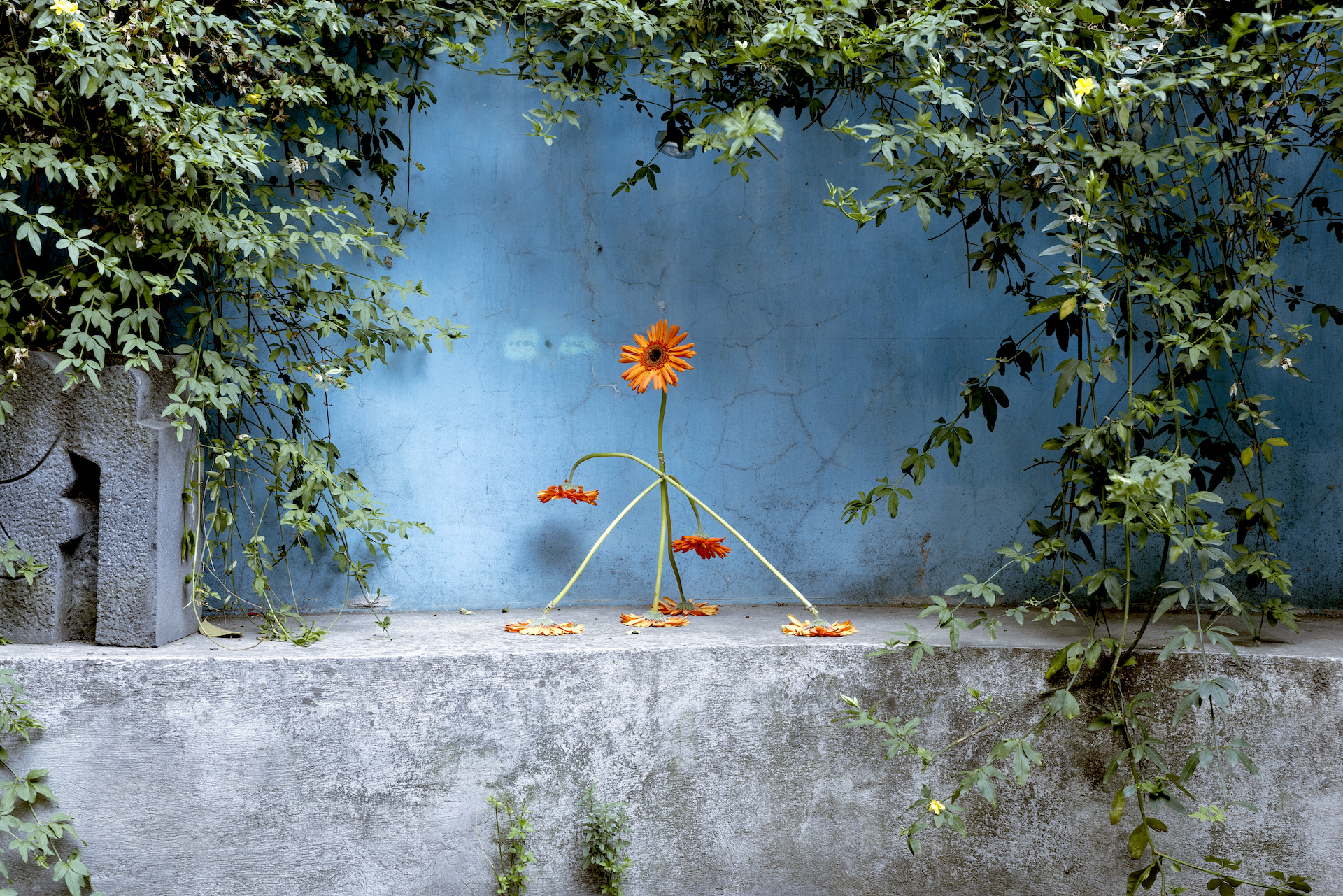
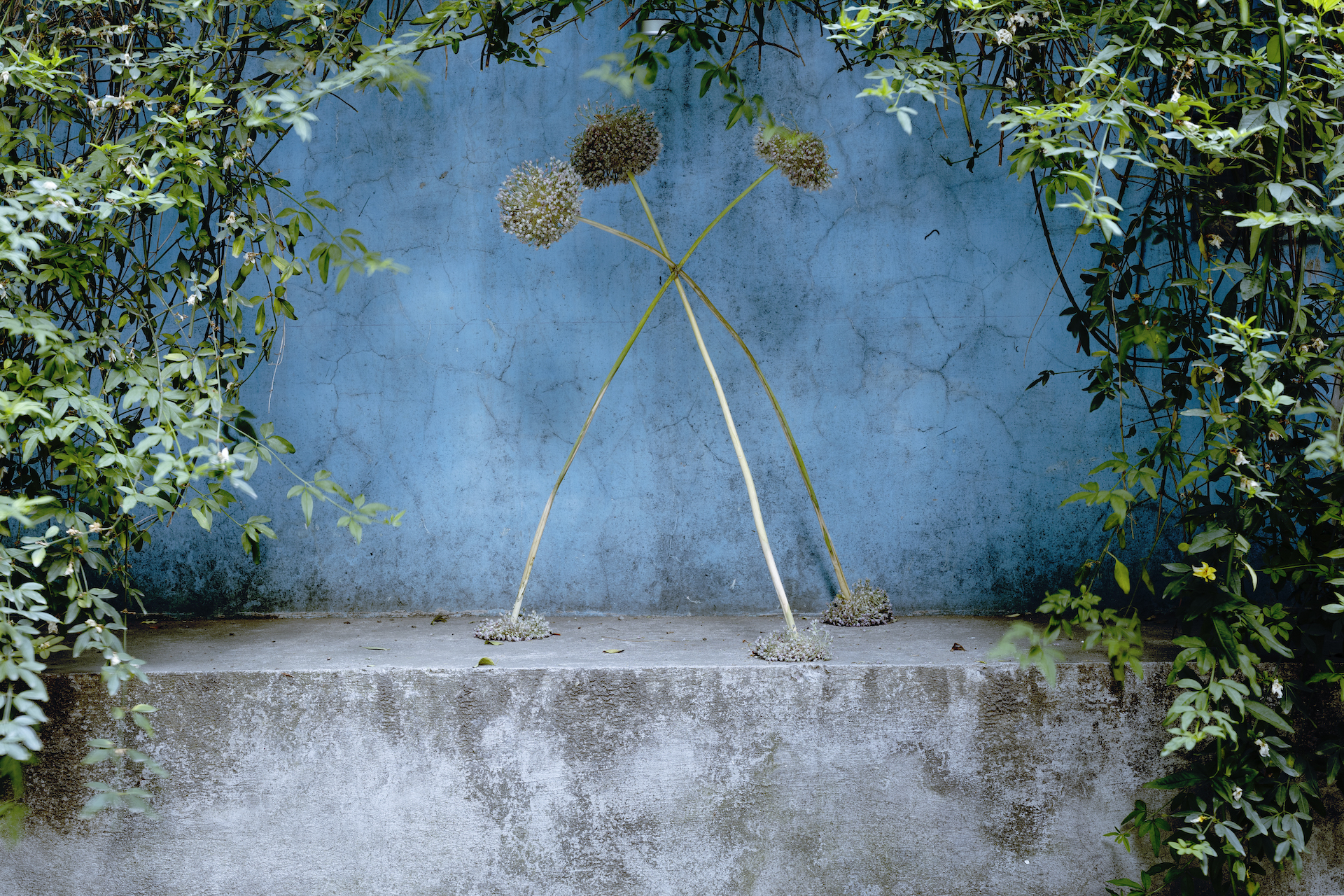
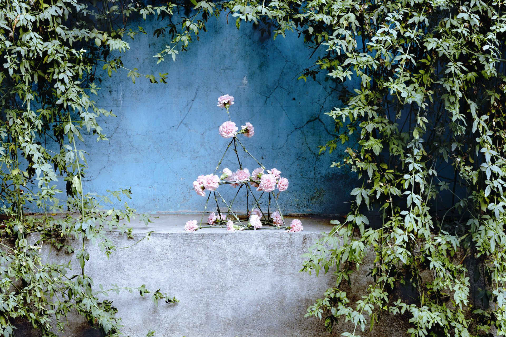
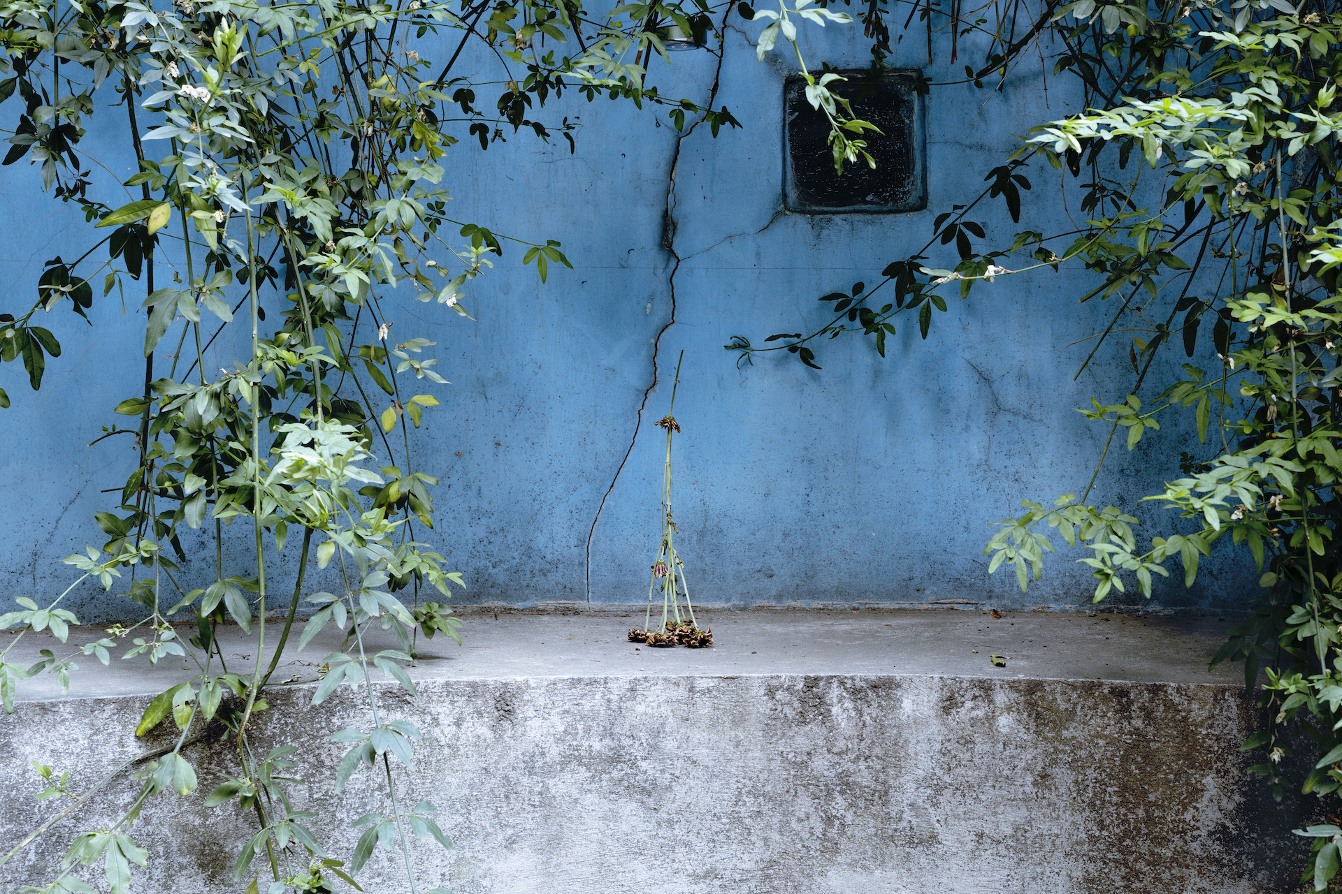
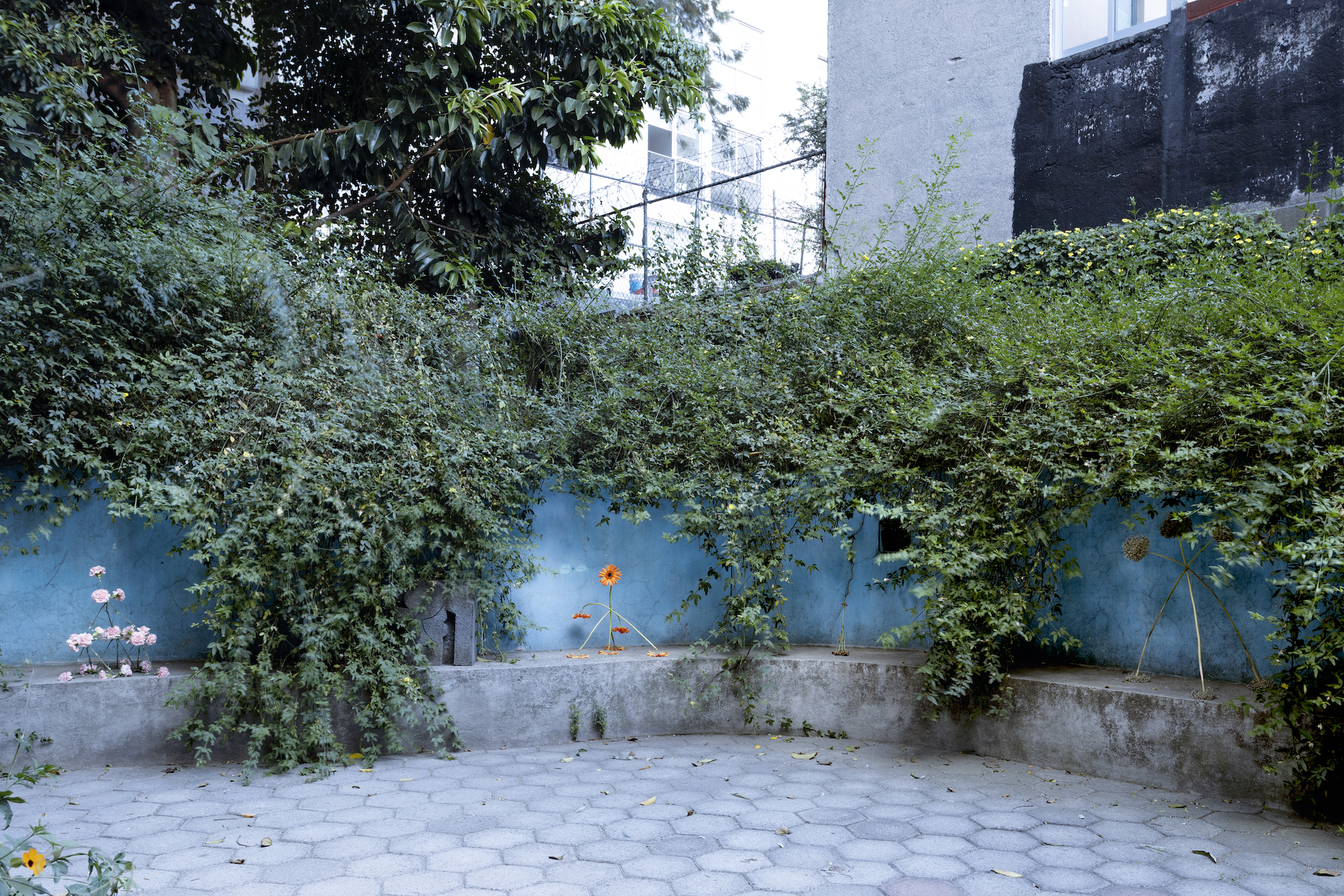
The living sculptures were installed in the garden of INSTABLE.
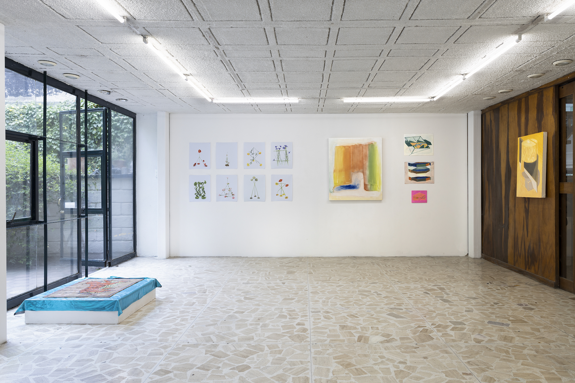
Prints of the sculptures at INSTABLE
07.10.23
ESSAY: Flowers Arranged
Earlier this year I participated in a six week residency in Mexico City at Casa Lü. The outcome of this residency was a series of sculptures called Flowers Arranged. During the residency, alongside developing my project I wrote an artist’s essay about my practice. This is the first time I have ever done this kind of essay writing, so do excuse any clunkiness.
Introduction
The intention of my stay at the Casa Lü was to explore creating sculptures using organic materials. In my practice, I have previously created sculptures inspired by flowers using manmade materials such as acrylic, which are harmful to our environment. During the residency I wanted my main source of inspiration (flowers) to become my construction material. To quote Marshall McLuhan ‘the medium is the message’. By using living materials (or dead materials, depending on how you view the world) I was confronted with a new set of design challenges and opportunities. Flowers Arranged is the outcome of five weeks of experimentation and this personal essay will go deeper on my thought processes, references and ideas.
Why Flowers?
I am a city person. Nature hasn’t always been in my nature. Of course, growing up we would visit the countryside and the beach, but I always felt like a visitor in these environments. I was a neat, city child a bit overwhelmed by how wild, scary (constantly fearful of being stung by nettles) and vast the natural world was. Then I much preferred man-made depictions of it instead - chintzy floral Cath Kidston patterns or sickly sweet rose fragranced bubblebaths. No risks of being scratched by thorns or stung by a nearby bumble bee. Only now I realise that imitation is nowhere near as good as the real deal.
When I moved to The Netherlands, eight years ago, I fell in love with how embedded flowers were in their culture. As one of the world’s biggest exporters of flowers, the Dutch enjoy their own blooms as much as those who they sell them to around the world. Flowers are a part of everyday life. They are not seen as an extravagance but like any other essential that you would add to your weekly grocery list. They are very inexpensive and are a casual way of saying many things; thank you, I love you, congratulations, I’m sorry. I feel like the action of giving flowers is more ordinary and less of a grandiose statement than in the UK. A common sight I love to see in Amsterdam is someone cycling one handed carrying a bouquet of flowers in the other hand - I romanticise in my mind a story about where they are heading, who they are giving the flowers to and what big or small occasion it is marking. This sight is proof to me that even though we live in an often horrible and violent world, people still want to inject beauty into it and give love to others. And that is what my art is all about; the desire to create beauty and to spread love or optimistic messaging.
I have embraced the Dutch way of life, and try to live with flowers in my apartment and gift them frequently too. They have become as much a part of my interior decor style as the carefully selected artworks hanging on the walls. But they differ slightly to the more classical art because they are shape shifters, changing their form as the days pass and they do not have a permanent presence. Perhaps their impermanence is what makes me cherish them and pay attention to them dearly. Flowers are quick fix to bring joy into my life and in someways my previous series ‘Freshly Cut Flowers’ was an attempt to immortalise that emotional connection.
When a relative of my family was sick in hospital I was very shocked to hear from my mother that most wards in the UK do not like to receive plants as gifts for patients because harmful bacteria can grow in the water. I found this devastating to hear, as in these situations when you don’t know what to say to a poorly person, flowers can say enough and provide cheer or a reminder of the beauty in our brief lives, which is often needed in these trying situations. Flowers can speak, when we don’t have the right words. They are an international language of optimism and also condolence. I am as equally obsessed with the messages that flowers symbolise as much as what they visually look like.
I have used flowers as a theme in my work because I believe that they are a love language. We all deserve to feel love every single day, even if we are giving it to ourselves. Because what is the point in living a life without love?
Sculpture vs still life
My work straddles both the worlds of sculpture and still life. I create sculptures which are intended to be arranged into still life or sometimes the still life concept comes first and then sculptures are created specifically for a particular idea
The dictionary definition of a sculpture is the art of making three-dimensional representative or abstract forms, especially by carving stone or wood or by casting metal or plaster. I do not possess the impressive skills that dedicated carpenters, ceramicists or stone masons build over a lifetime. I work quickly, intuitively and make up my own rules, which is the complete opposite to the true masters of sculpture. My lack of formal training in sculpture, allows me to work in a way that I find most comfortable and stimulating - creating simple, graphic depictions that spark something in the viewers imagination. By making these objects tangible and something you can hold in your hand (rather than let’s say digital images) I hope to give the viewer the belief that there are many joyful moments to stumble across in our world through encounters with objects.
In my photo series KAASVAAS (2022), the arrangement of a still life actually became the sculpture. In this project I combined the Netherlands two biggest exports - tulips and cheese. I treated the cheese as though it was a Delft tulip vase, with each hole holding a single flower and each block of cheese becoming a vase. In this project my design decisions were dictated by the organic nature of the cheese, not my own imagination. I found this new way of working exciting as it led to forms and compositions I would never create myself but the outcome still communicated joy and optimism like my other projects, maybe in an even more refreshing way. This realisation was the reason why I wanted to work with organic materials during my time at the Casa Lu residency.
The project ‘100 Chairs in 100 Days and Its 100 Ways’ by Martino Gamper has been a huge inspiration for me, since my days as a graphic design student. The simplicity of his proposition (making a chair each day for one hundred days) and the process of repetition allowed for him to create a unique visual language over the duration of the project. Even though the chairs were created as individual pieces of furniture, they some how have a dialogue between each other - this personification of objects intrigued me greatly. As the way that many people understand our world is through personification. During my stay at Casa Lü, I set myself a similar framework - each day to create a new sculpture from organic materials. I have always been a fan of rapid prototyping and hoped to find a new visual vocabulary for myself through repetition, informed by the natural world.
Flowers Arranged
Initially, the daily sculptures I was creating were made up of a variety of different natural materials such as sticks, cactuses, fruits, flowers and leaves. It wasn’t until the fifth day I landed on a sculpture that both intrigued and excited me. This sculpture was made entirely from flowers and seemed alive (even though it was dying) with it’s own personality - I had never seen a flower arrangement like this before. For the next fifteen days, I continued to make sculptures only from flowers which could stand independently, each sculpture had to have a different construction from the previous one. The outcome of my time at Casa Lü is a series of sculptures called ‘Flowers Arranged’.
Flower arranging is broadly defines as the art of selecting and organising flowers and foliage according to the elements and principles of design in order to attain a pleasing and interesting design. My series scraps the traditional principles of floral design and instead focuses on organising the flowers by using framework structures. Another difference is that my form of flower arranging does not use containers, vases, pinpoint holders or floral foams. I limited myself with slotting, balancing and tying using thin strips of leaf. By not using the traditional tools, the sculptures I built had to be structurally sound. I took inspiration from geometry textbooks for formations to attempt mimicking. Creating a freestanding bouquet was an achievement enough, my focus was on making the sculptures stand independently rather than if they were pleasing to the eye. I threw the traditional rules of Ikebana, harmony and balance out of the window. Ultimately, the structure became the decoration - the beauty lies in how utilitarian the sculptures are.
Alongside building the sculptures, watching them die has been an interesting process for me. In my practice I have always strived for clean, tidy and pristine work. However, by building sculptures with organic materials over the course of several weeks, I have learnt to find beauty in their wilted leaves, the faded colours and the wrinkled petals. As part of the exhibition I have chosen to include the dying sculptures (which are losing their form) as a reminder of human’s impossible desire to preserve beauty. By watching them die, I realised that my sculptures are Still Dead rather than Still Life, by changing one word my mind has been opened and I would love to investigate this notion further in the future.
I hope that Flowers Arranged challenges viewers perception of conventional decorative beauty both within the floral and wider world. By arranging flowers in an unconventional way without fancy vases or specialist equipment, I am putting the beauty of nature on a pedestal - nothing is competing with the flowers natural design. It is up to the viewer to decide if they want personify these sculptures or not. But if they do choose to personify them, I have successfully breathed a final last breath of life into something that is dying - my humble way of saying thank you to the flowers for being so beautiful.
〰〰〰〰〰〰〰〰〰
15.06.2023
NATA CONCEPT COLLAB: Table Twins
Nata Concept are a creative duo I have admired for some time, they make the most playful candles. When I visisted their North London studio in 2021 we discussed making something together and the result of merging our visual worlds together was Table Twins.
Table Twins is a pairing of two objects; a candle and a flower. The slot-together construction technique of the flower sculpture was translated into wax and the candle leant its shape to the flower. Resulting in two objects that fit together physically and aesthetically.
Table Twins is a pairing of two objects; a candle and a flower. The slot-together construction technique of the flower sculpture was translated into wax and the candle leant its shape to the flower. Resulting in two objects that fit together physically and aesthetically.
![]()
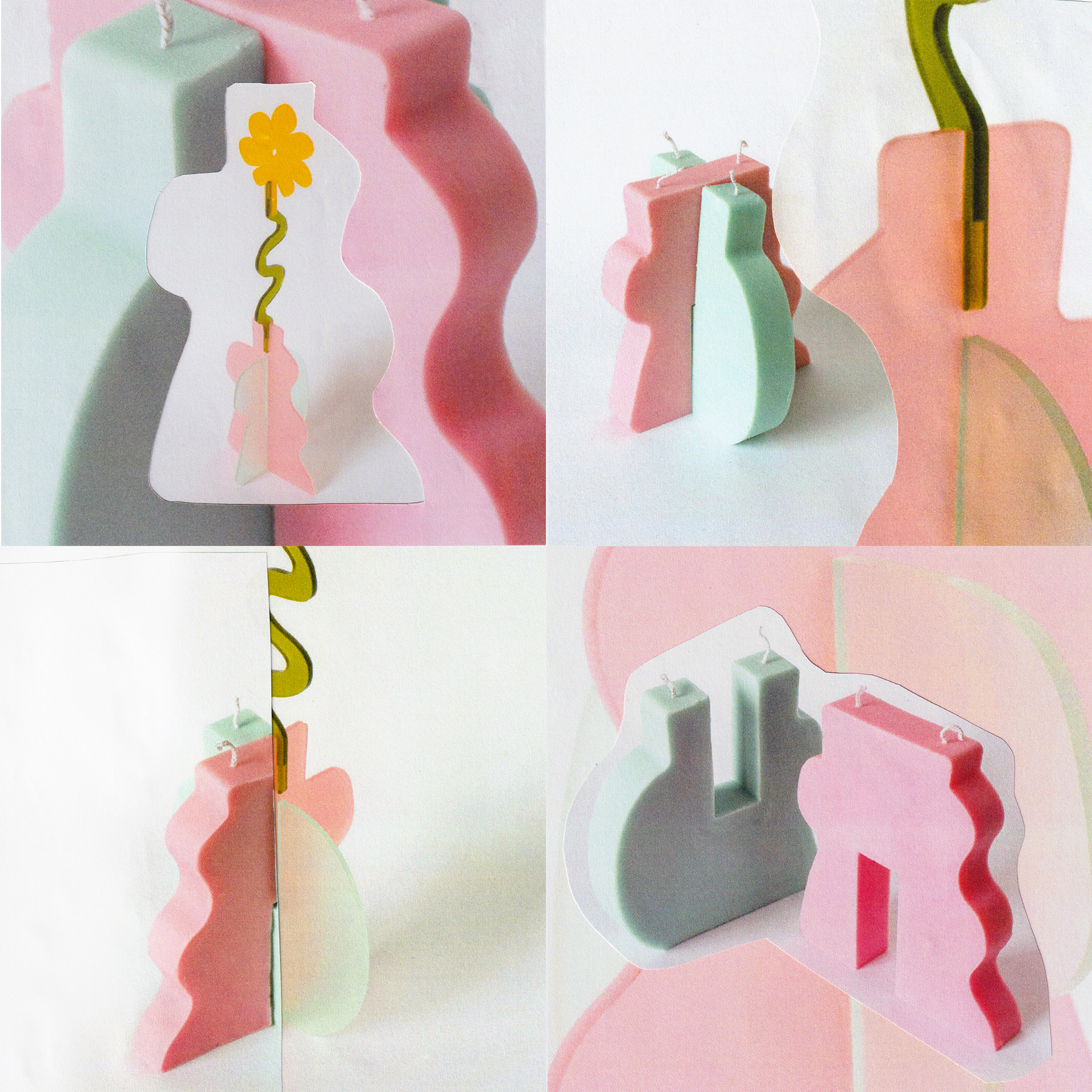
Collage showcasing the candle and sculpture
From the start we knew that we wanted to create a slotting together candle. Creating many versions, variations and iterations of a product is the most exciting part for me. This video shows how important testing is for my process, I switch between hand-drawing, digital 3D drawings and eventually physical maquettes.
Shop Table Twins here.
My design development process
〰〰〰〰〰〰〰〰〰
28.02.2023
MIRROR WATER: Interview
Last year I spoke to Julie at MIRROR WATER about my creative process and how I balance my freelance work and my own artistic practice.
Here you can read the article.
〰〰〰〰〰〰〰〰〰
Here you can read the article.
〰〰〰〰〰〰〰〰〰
24.10.2022
Birdsong T-shirt Collab
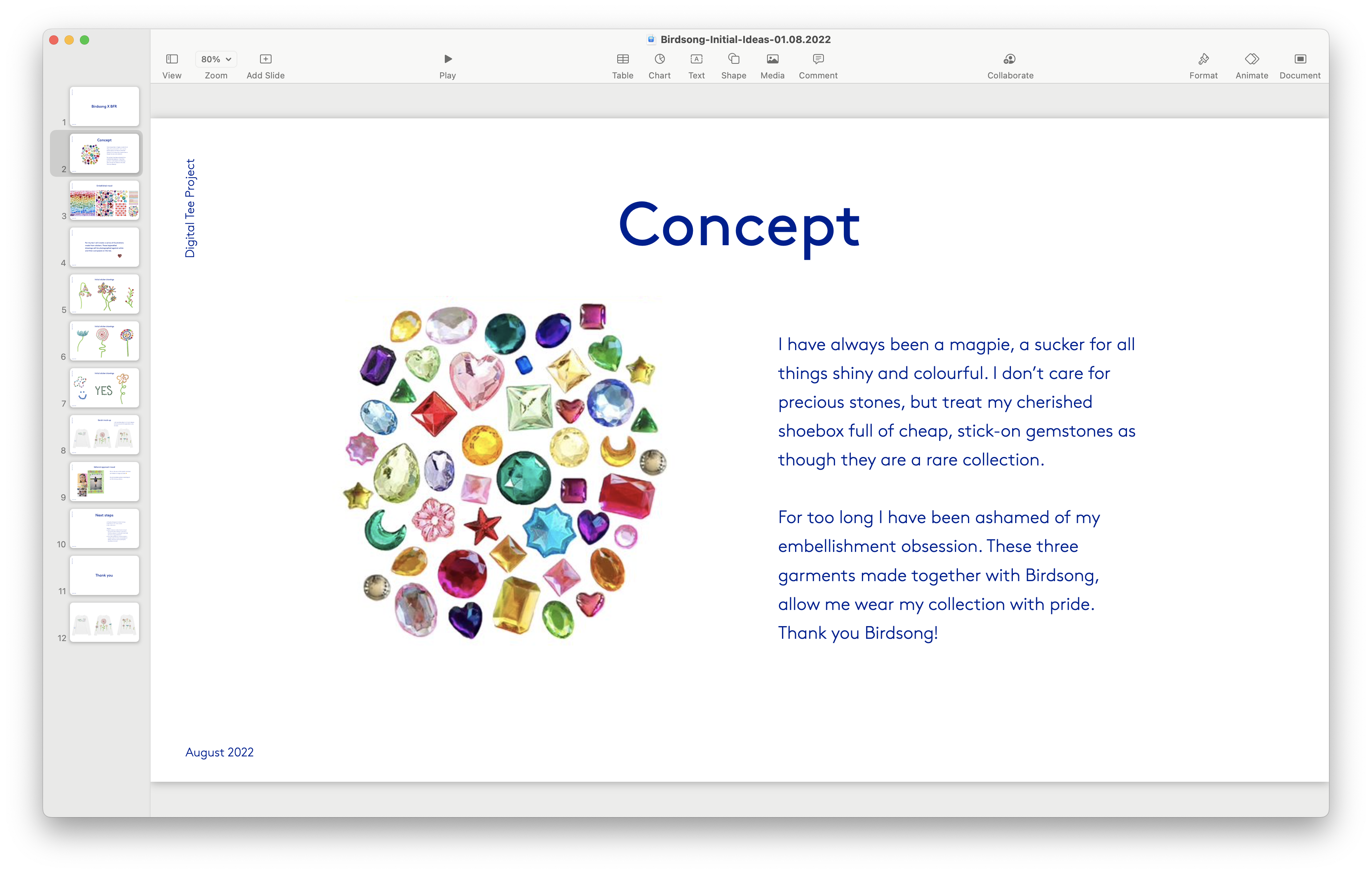
I’m happy to share that I’ve worked with Birdsong London to create some designs for them! If you don’t know Birdsong they are an ethical and sustainable fashion brand. But first and foremost they are a social enterprise. They work to empower marginalised women in the UK and provide meaningful, dignified work and living wages to the local communities they support.
![]()
![]()
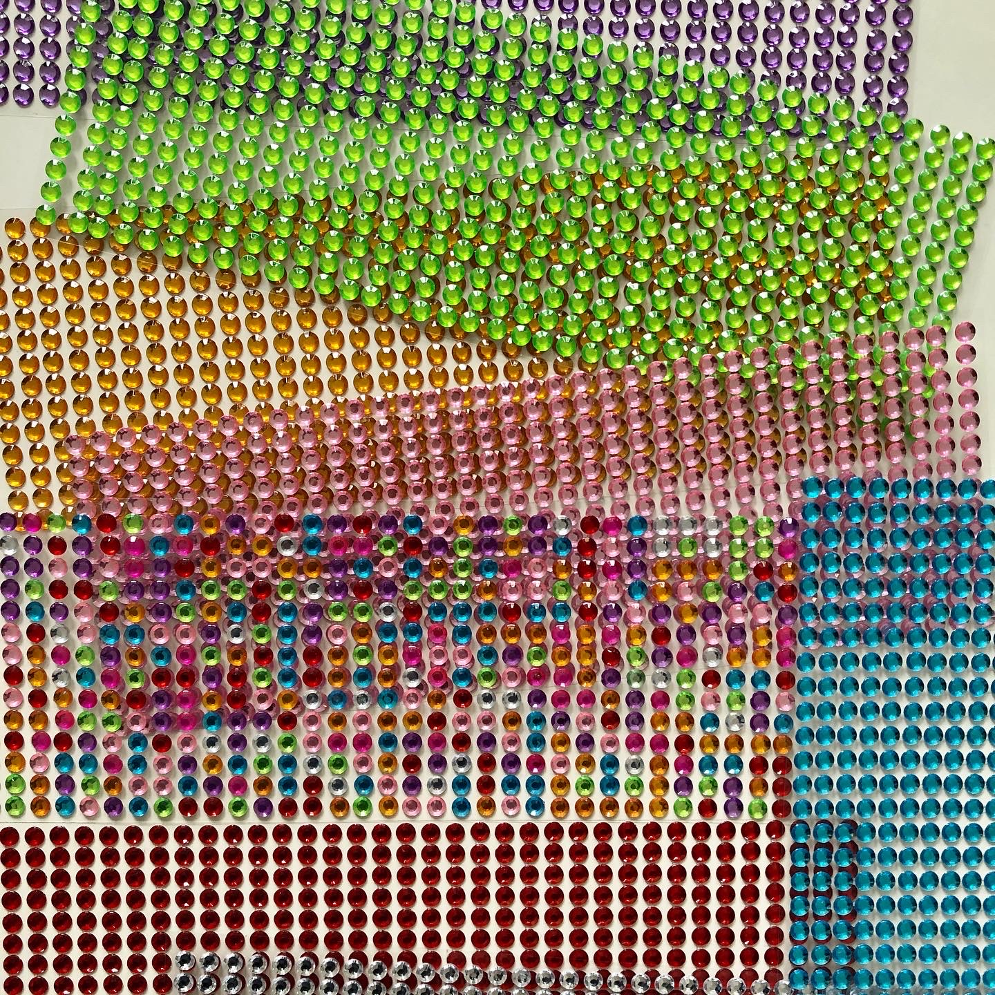
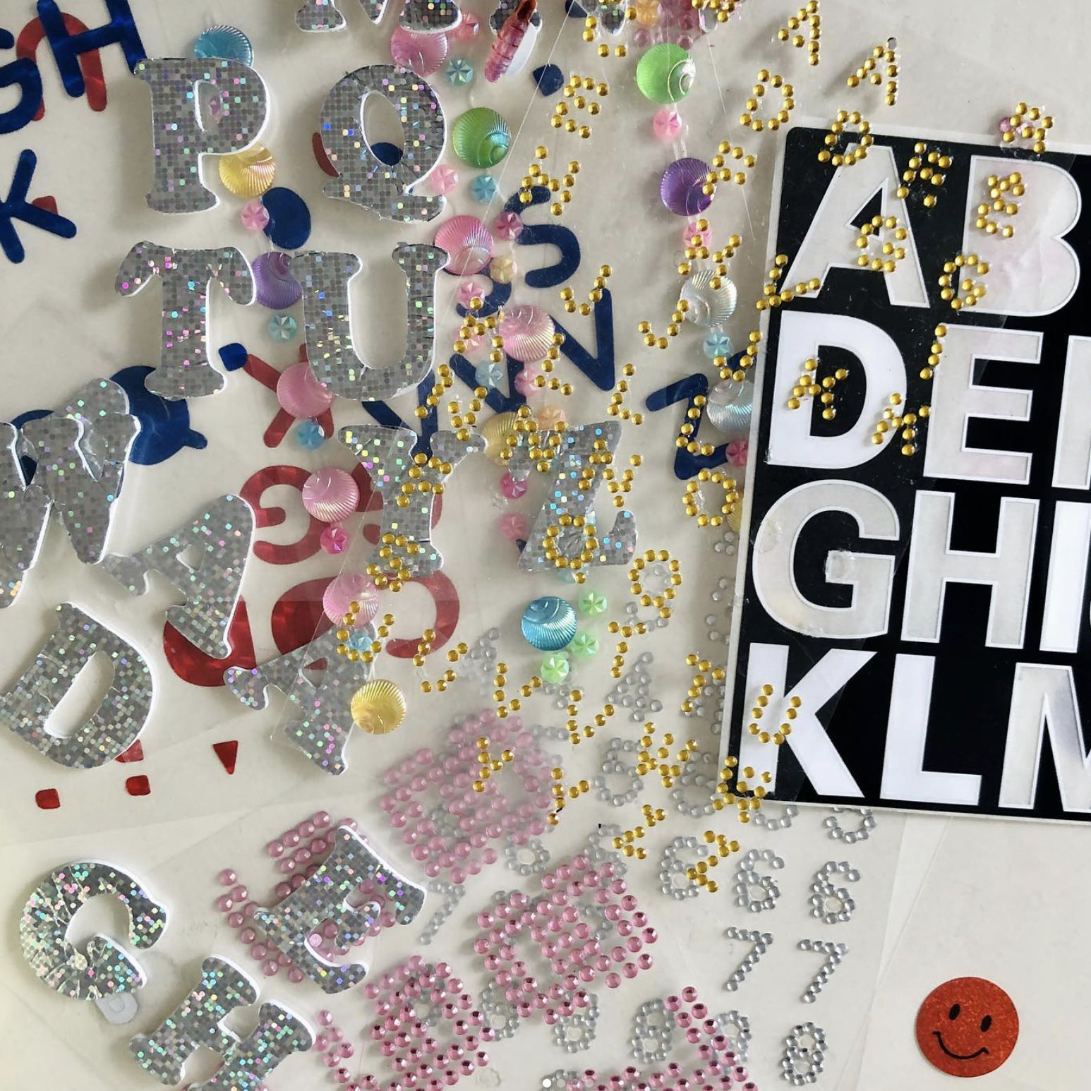
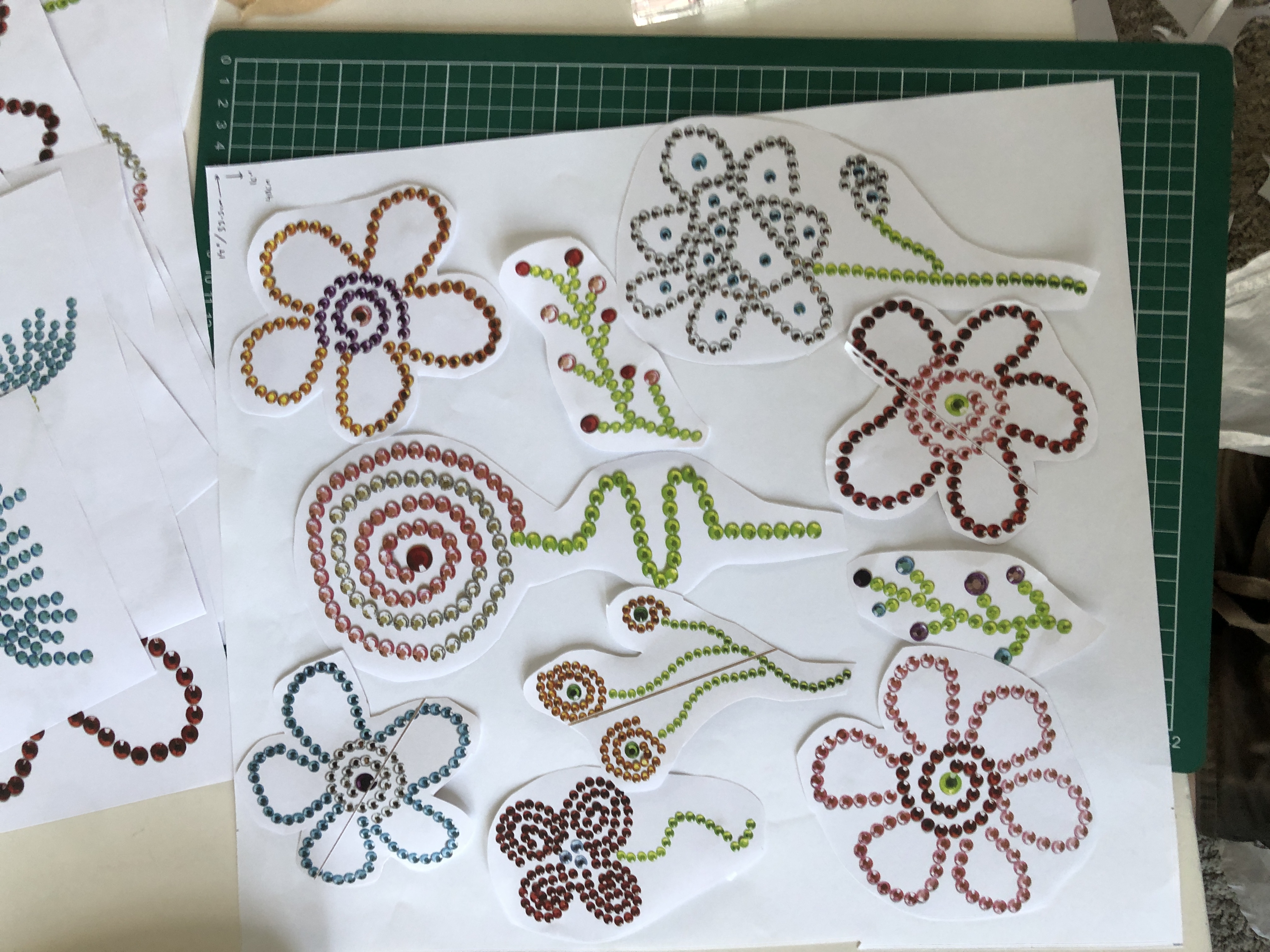
My designs were inspired by my love for embellishment and my gemstone sticker collection.
![]()
![]()
![]() A snippet of my sticker collection.
A snippet of my sticker collection.
For this t-shirt I wanted to embrace the technique of digital printing and the high resolution of Birdsong’s direct to garment printer. From the start I knew that I wanted to create a photographic trompe l’oeil to test the capacities of the printer. Even though this was a digital project, I’m pretty analogue with my approach and began sketching out with pencil and paper, before creating the jewel florals.
![]()
![]()
I’m happy to share that I’ve worked with Birdsong London to create some designs for them! If you don’t know Birdsong they are an ethical and sustainable fashion brand. But first and foremost they are a social enterprise. They work to empower marginalised women in the UK and provide meaningful, dignified work and living wages to the local communities they support.
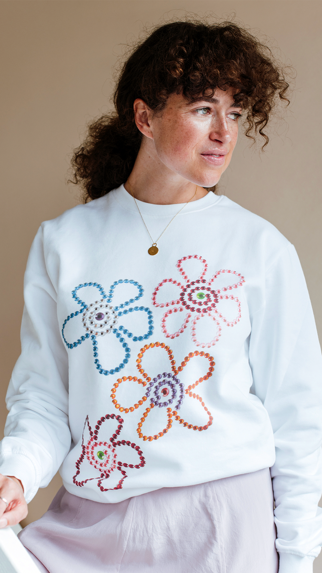

The final designs, photographed by Rachel Manns
My designs were inspired by my love for embellishment and my gemstone sticker collection.
For this t-shirt I wanted to embrace the technique of digital printing and the high resolution of Birdsong’s direct to garment printer. From the start I knew that I wanted to create a photographic trompe l’oeil to test the capacities of the printer. Even though this was a digital project, I’m pretty analogue with my approach and began sketching out with pencil and paper, before creating the jewel florals.
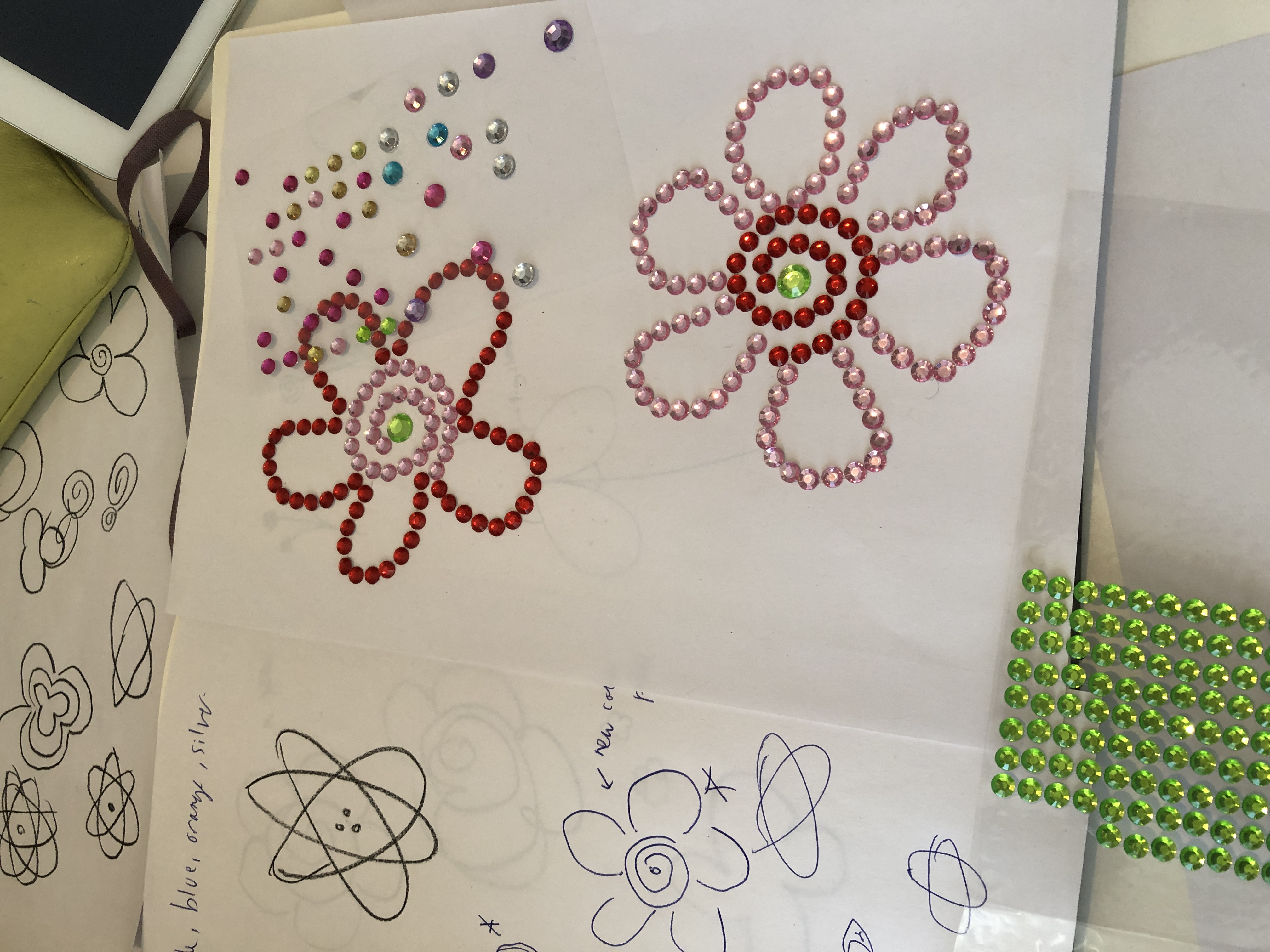
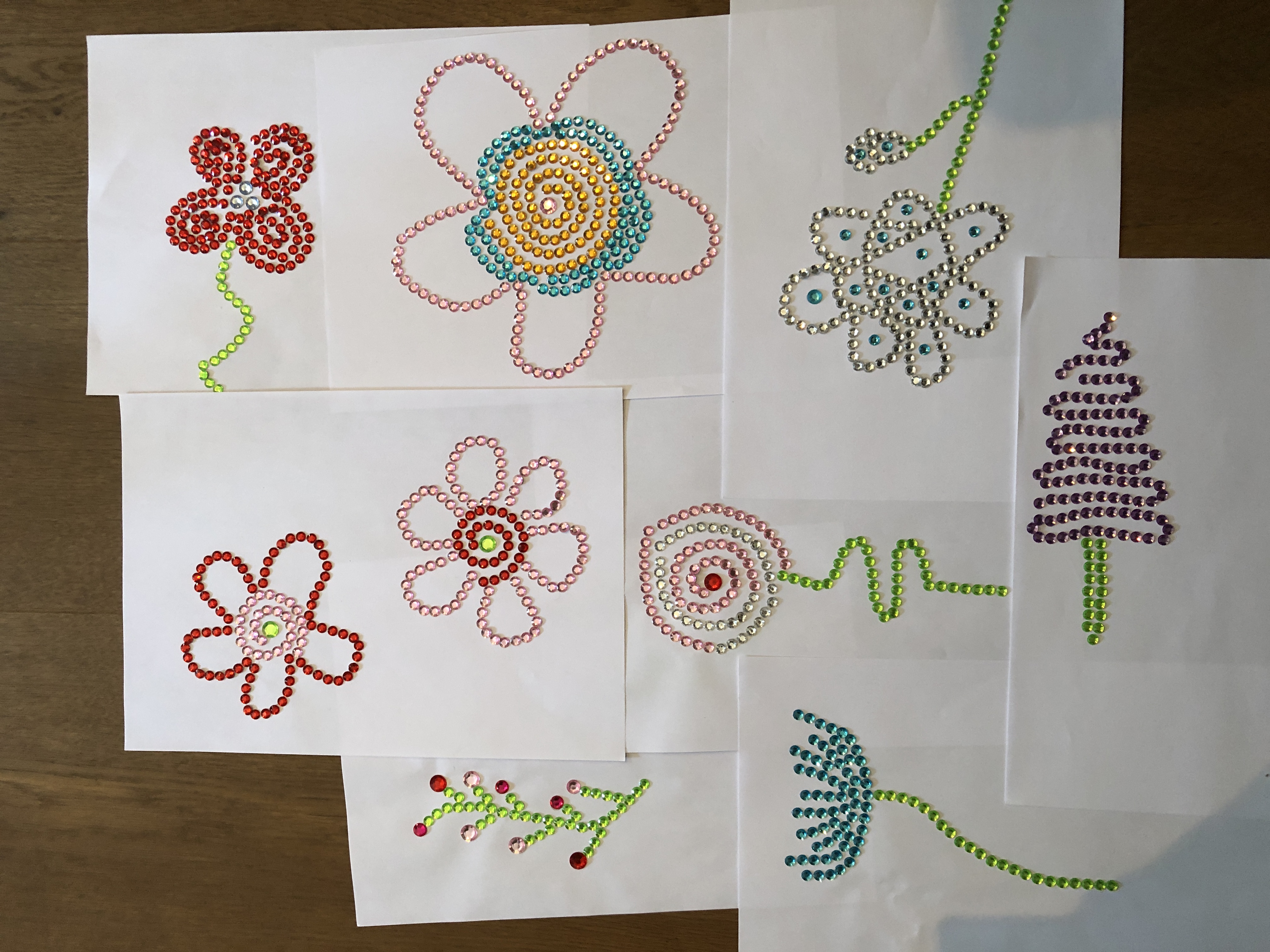
Then I photographed the designs and edited them in Photoshop to have transparent backgrounds and consistent lighting. To come up with the composition I really like to play around with scissor and glue, I feel that I get more intuitive layouts working this way. So I print out each motif in a few sizes and have a play around. Once I have a layout I’m happy with I take a quick iPhone pic and then recreate this digitally in Photoshop. This process may sound long but I really enjoy it and think if you are making a physical object you should have some physical steps in your process
Shop the Birdsong tee collab here.
〰〰〰〰〰〰〰〰〰
01.08.2022
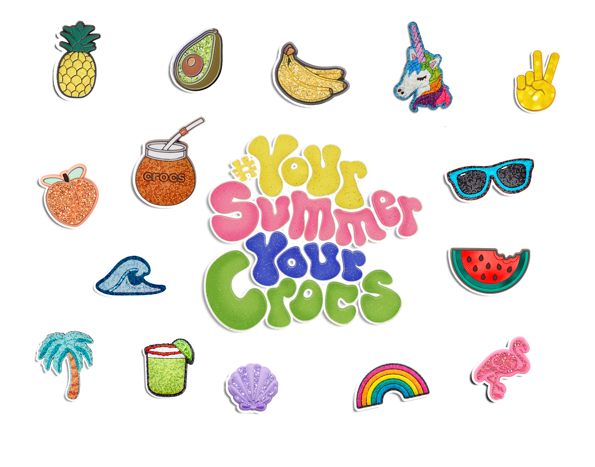
Your Summer, Your Crocs
This summer is Croc’s 20th anniversary 🥳🐊! To mark the occasion I designed a logo and sticker pack inspired by their Jibbitz* in an early noughties style for them. As a sticker obsessed ten year old back in 2002, this was a dream to create. Working with Hey Honey, the designs were used across social, e-commerce and even for Crocs presence across festivals this summer.
*FYI for all those who are Crocs skeptical - ‘Jibbitz’ are fun shoe charms that are popped onto Crocs to customise them.
![]()
〰〰〰〰〰〰〰〰〰
This summer is Croc’s 20th anniversary 🥳🐊! To mark the occasion I designed a logo and sticker pack inspired by their Jibbitz* in an early noughties style for them. As a sticker obsessed ten year old back in 2002, this was a dream to create. Working with Hey Honey, the designs were used across social, e-commerce and even for Crocs presence across festivals this summer.
*FYI for all those who are Crocs skeptical - ‘Jibbitz’ are fun shoe charms that are popped onto Crocs to customise them.
〰〰〰〰〰〰〰〰〰
10.05.2022
Ukraine Crisis Fundraiser
Peace for Ukraine 🌼💙 For each sale of this sculpture, €40 will be donated to Choose Love’s Ukraine Crisis fundraiser - read about their campaign here. Donations are made each Sunday and proof will be forwarded to those who have purchased.
![]()
![]() Buy the sculpture here
Buy the sculpture here
〰〰〰〰〰〰〰〰〰
Peace for Ukraine 🌼💙 For each sale of this sculpture, €40 will be donated to Choose Love’s Ukraine Crisis fundraiser - read about their campaign here. Donations are made each Sunday and proof will be forwarded to those who have purchased.
〰〰〰〰〰〰〰〰〰
01.09.2021
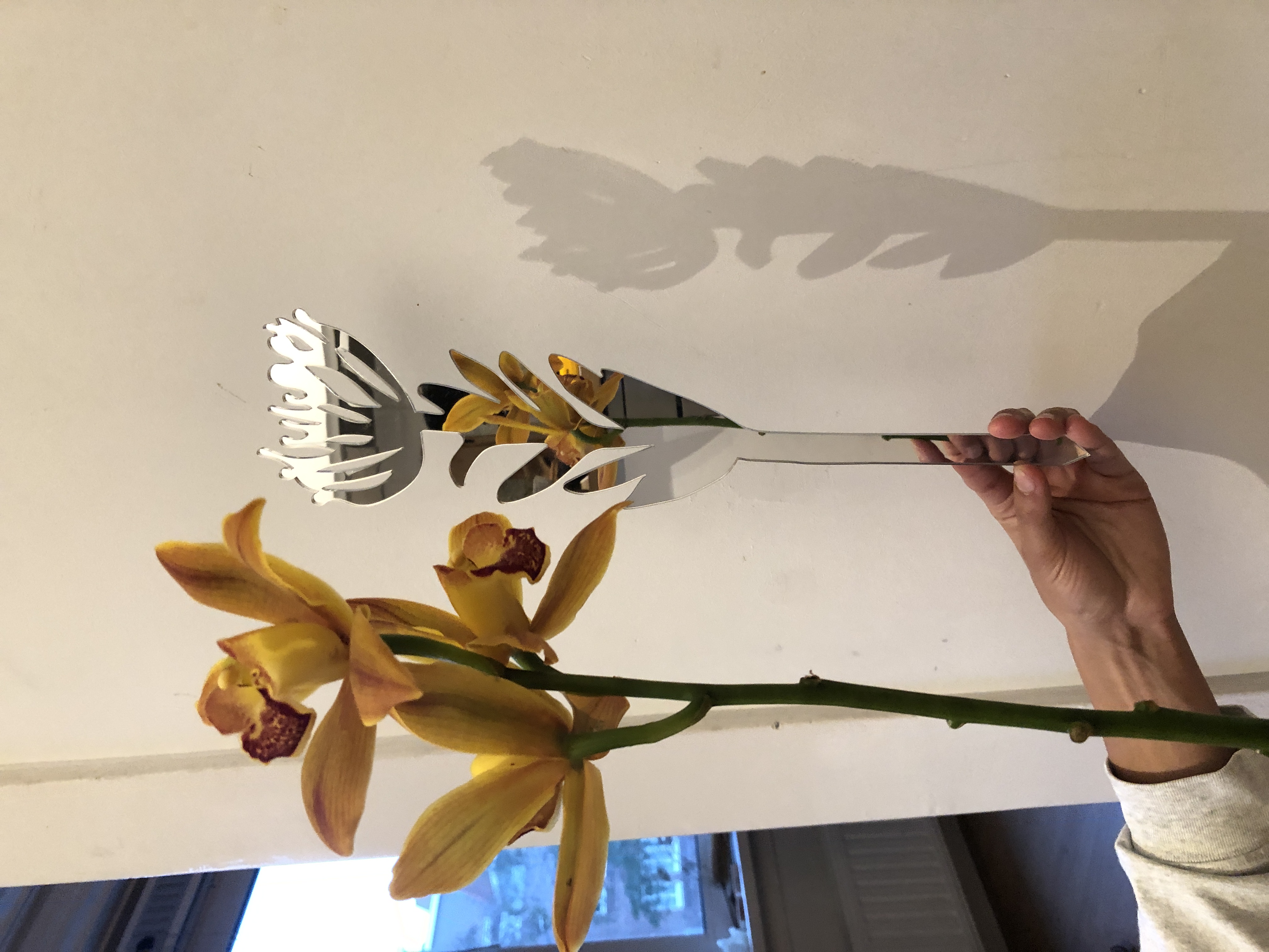
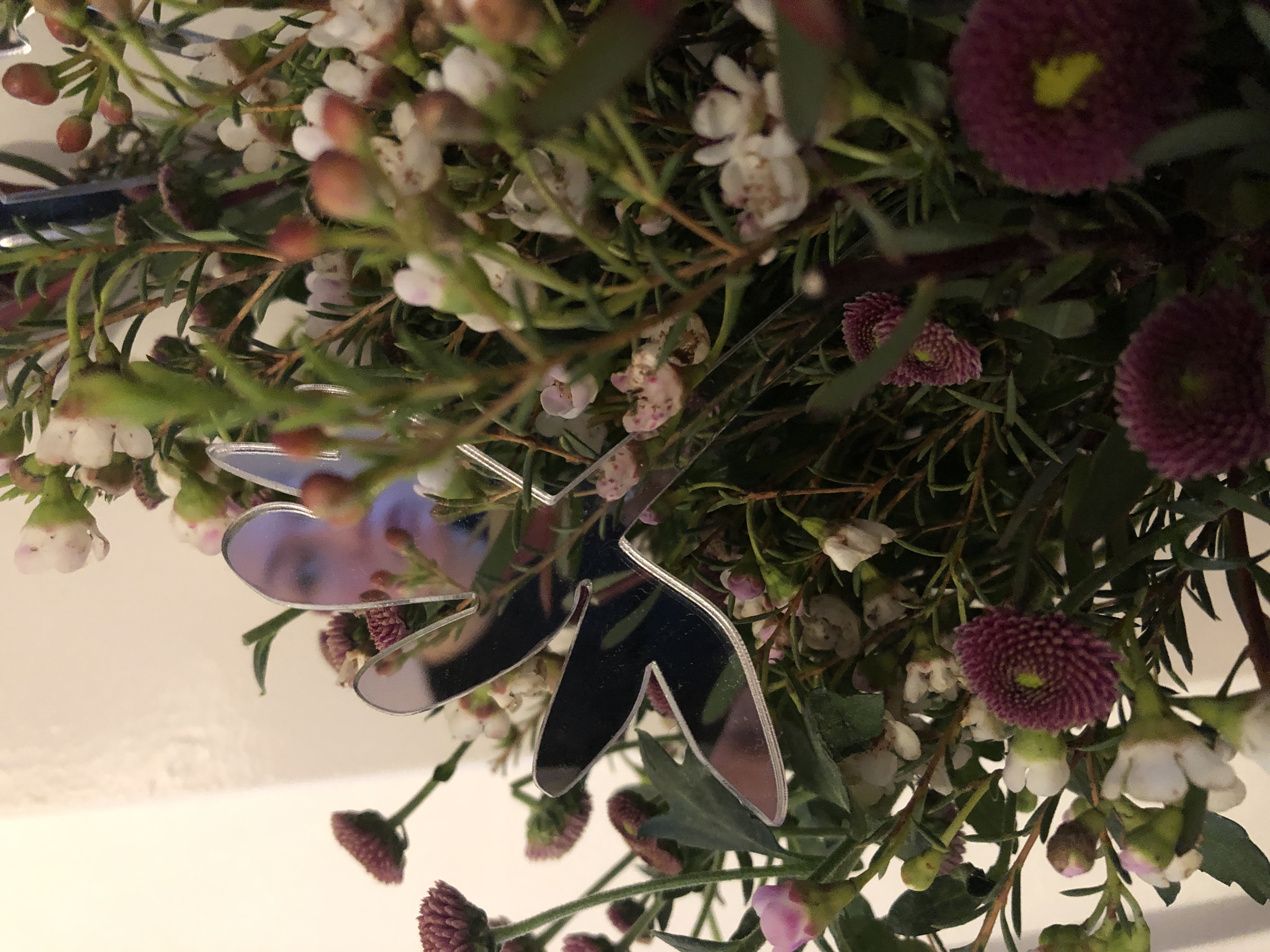
BTS: Flowers in a vase
Good things often taken time. And I really feel that way about my newest project ‘Flowers in a vase’. Sometimes creative brewing time is what makes things special. It usually is a luxury to have so much time to work on projects.
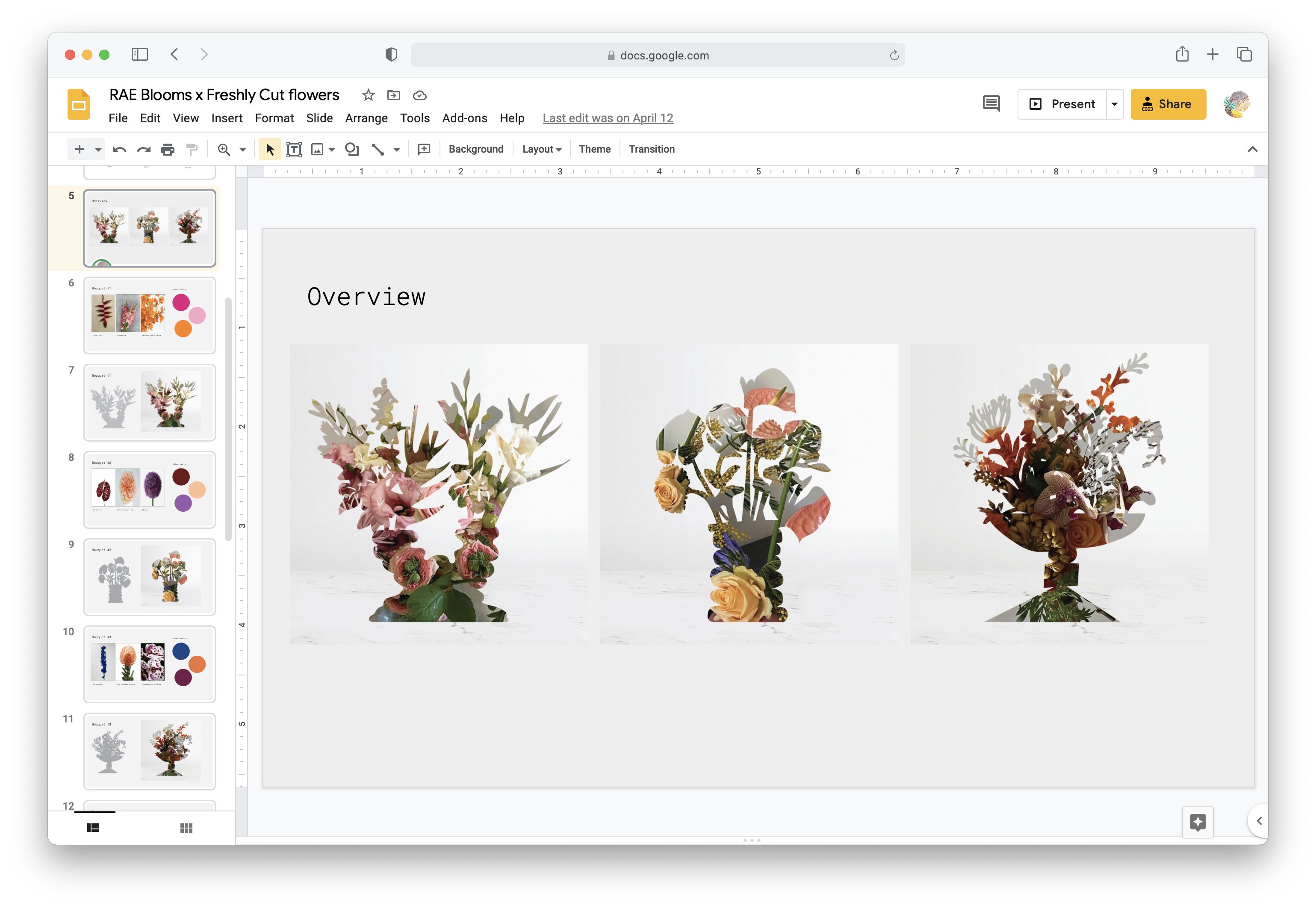
Last winter, Ariella (of Rae Blooms) approached me about doing a collaboration together. Her brief was clear; to combine her real bouquets with the artificial flower sculptures that I had been making. Ariella’s bouquets are so organic and alive, I thought ‘gosh, my floral sculptures will look so stupid and fake besides her truly living floral arrangements’.
![]()
![]()
Examples of Ariella’s work
The merging of flowers had to be one, were they worked together in harmony, rather than competing with one another. I had some mirror samples lying around that I was planning to make Christmas decorations from and then thought that mirror would be the perfect material for the sculptures in this project. I then began to sketch out floral elements, based upon the types of arrangement Ariella creates. Her compositions are so refreshing and playful - I designed lots of anthuriums, orchards and crab claws.
![]()
![]()
![]()
![]()
The first idea was to create individual mirrored stems that could be placed into Ariella’s bouquets, see images above. But this did not feel right. The scale of the mirrored flowers was far too small (to fully reflect the composition of the blooms) and also when placed in the bouquet the mirrored stems were becoming invisible and disappearing. However, we did know that we loved seeing a flower look at its reflection in a mirror the same shape as them. Time to rethink.
![]()
The surface area of the mirrors needed to be much larger to fully reflect Ariella’s blooms. After sometime playing around in my sketchbook and Illustrator, I designed three bouquets that sat in vases. The floral arrangements in these were selected by Ariella. From here, I created a digital mock-up (see above) but those images are impossible to create in real life - such is the problem with photoshopping. We had to figure out how to make this impossible image come to life.
Good things often taken time. And I really feel that way about my newest project ‘Flowers in a vase’. Sometimes creative brewing time is what makes things special. It usually is a luxury to have so much time to work on projects.
Last winter, Ariella (of Rae Blooms) approached me about doing a collaboration together. Her brief was clear; to combine her real bouquets with the artificial flower sculptures that I had been making. Ariella’s bouquets are so organic and alive, I thought ‘gosh, my floral sculptures will look so stupid and fake besides her truly living floral arrangements’.

Examples of Ariella’s work
The merging of flowers had to be one, were they worked together in harmony, rather than competing with one another. I had some mirror samples lying around that I was planning to make Christmas decorations from and then thought that mirror would be the perfect material for the sculptures in this project. I then began to sketch out floral elements, based upon the types of arrangement Ariella creates. Her compositions are so refreshing and playful - I designed lots of anthuriums, orchards and crab claws.
First prototypes
The first idea was to create individual mirrored stems that could be placed into Ariella’s bouquets, see images above. But this did not feel right. The scale of the mirrored flowers was far too small (to fully reflect the composition of the blooms) and also when placed in the bouquet the mirrored stems were becoming invisible and disappearing. However, we did know that we loved seeing a flower look at its reflection in a mirror the same shape as them. Time to rethink.
Mock-ups of vases
The surface area of the mirrors needed to be much larger to fully reflect Ariella’s blooms. After sometime playing around in my sketchbook and Illustrator, I designed three bouquets that sat in vases. The floral arrangements in these were selected by Ariella. From here, I created a digital mock-up (see above) but those images are impossible to create in real life - such is the problem with photoshopping. We had to figure out how to make this impossible image come to life.
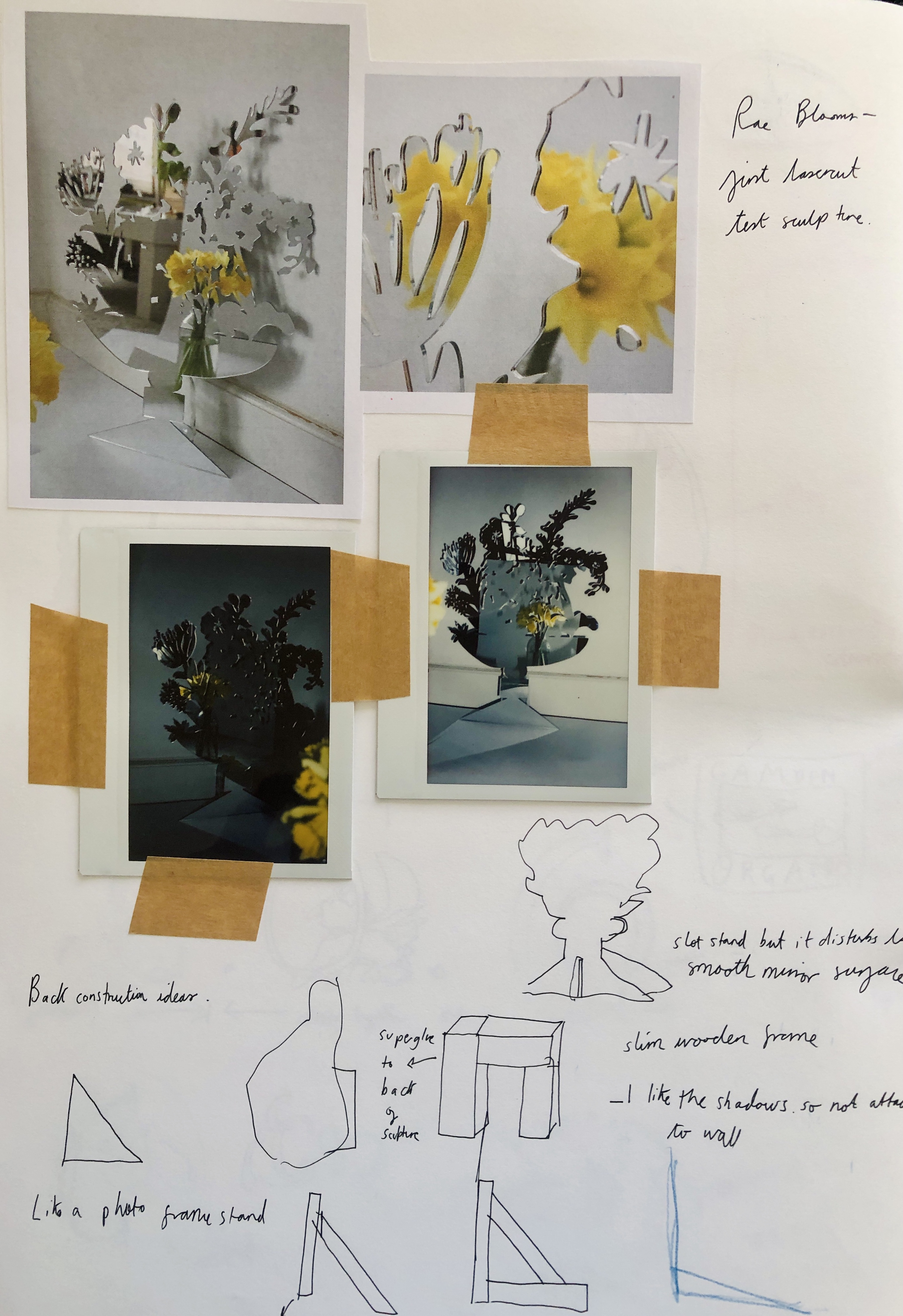
Sketchbook notes
By this point, I’d got my friend Annie van Noortwijk (who is a brilliant photographer) involved in the project. We whatsapped photos back and forth between the three of us about the best way to arrange the flowers in the mirror’s reflections. But the hurdle of the visible vase and the surface the flowers lived on, kept tripping us up. Gravity is a pain.
Come shoot day, we decided to throw the rules of gravity out of the window and create air ikebana. Ariella arranged the flowers, against the laws of physics and created the most playful compositions - a bouquet that can only really exist in an image.
I love working in this way, when the outcome isn’t obvious at the beginning and working with others whose craft is different to mine. I’m always looking for new collaborators, so if you’re reading this and would like to work together, don’t hesitate to drop me a mail ;-)
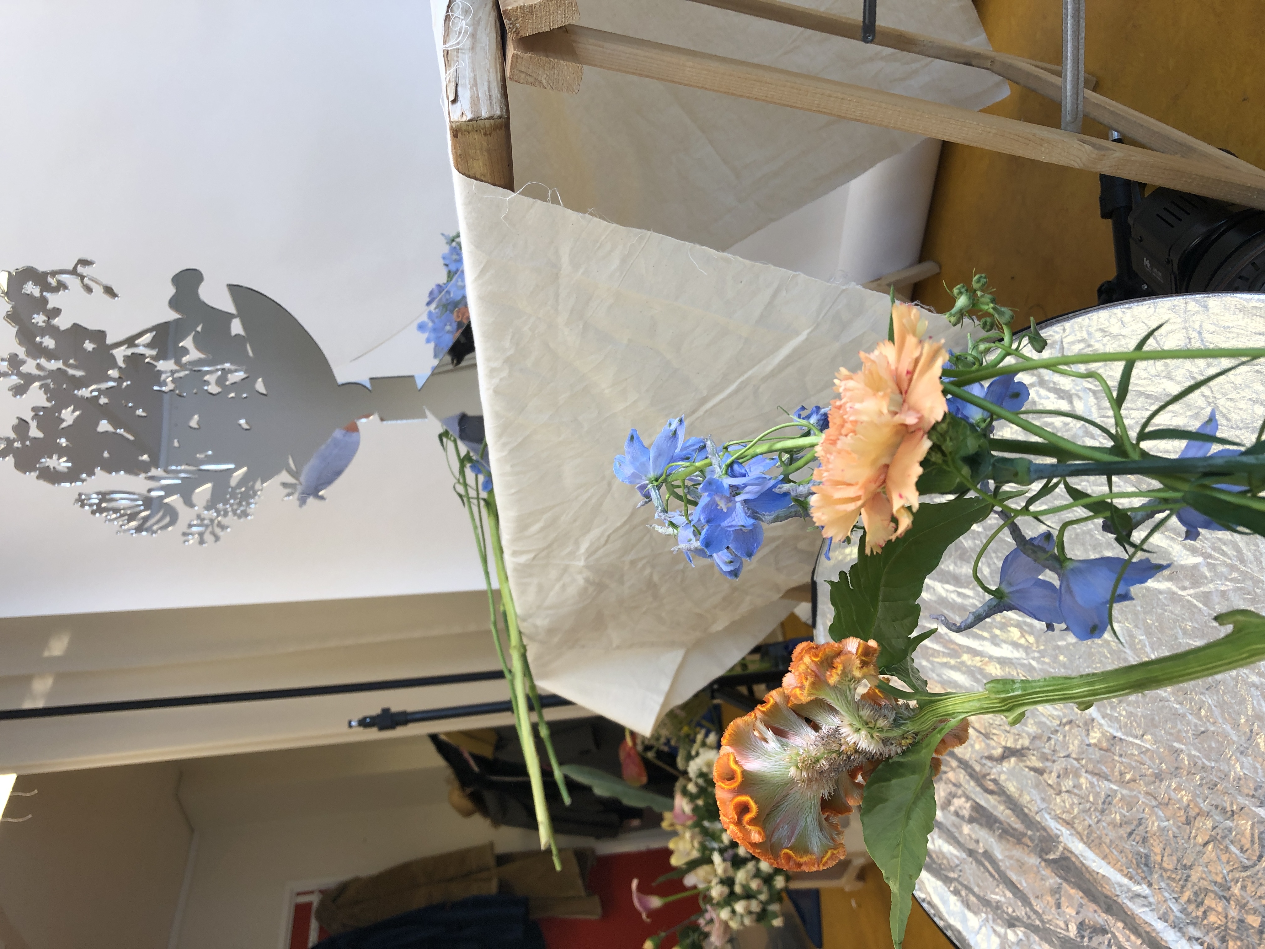
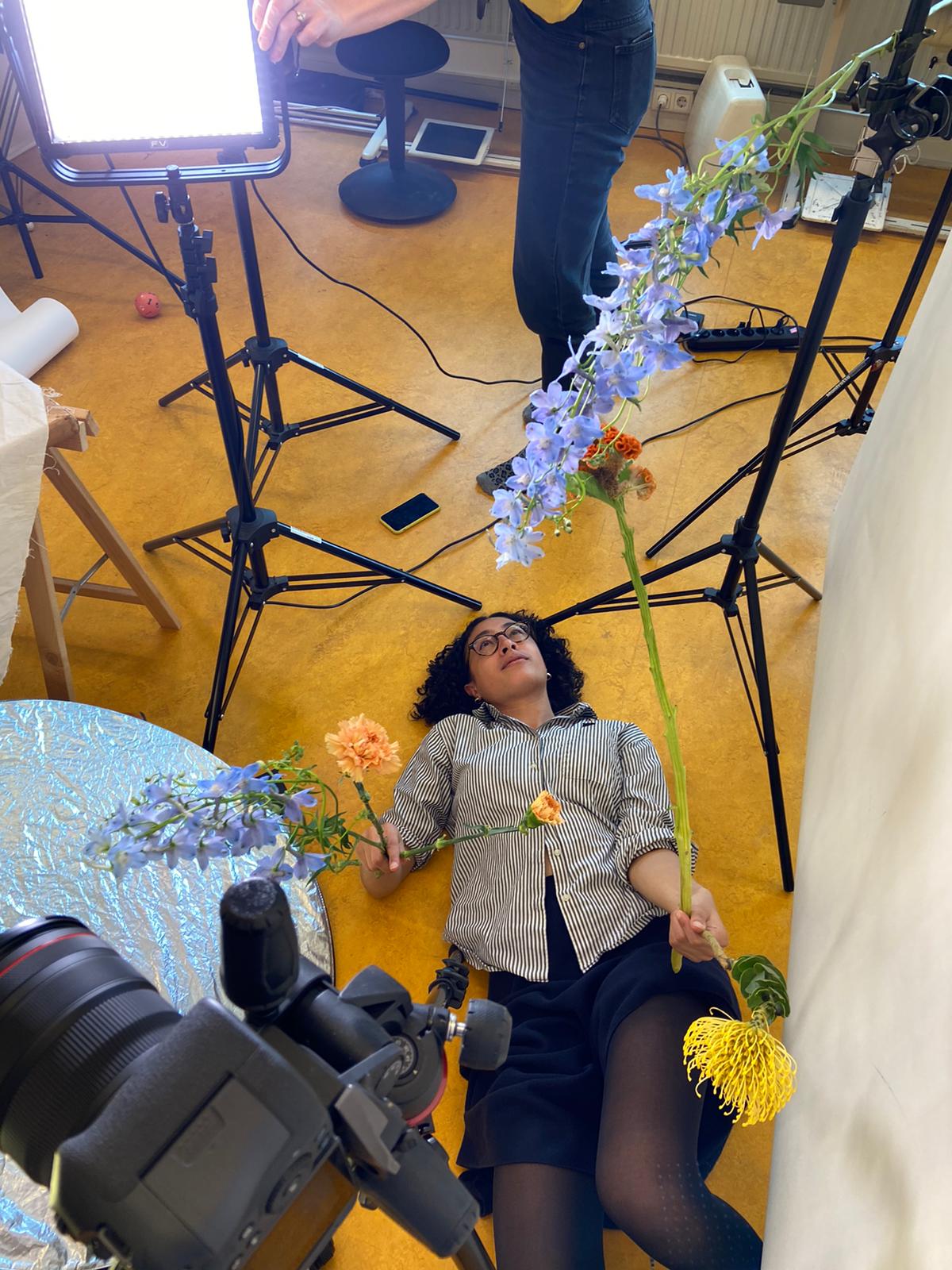
Shoot day
![]()
![]()
![]()
The three final vases
〰〰〰〰〰〰〰〰〰


The three final vases
12.05.2021
Feature:
House & Garden Magazine, May 2021
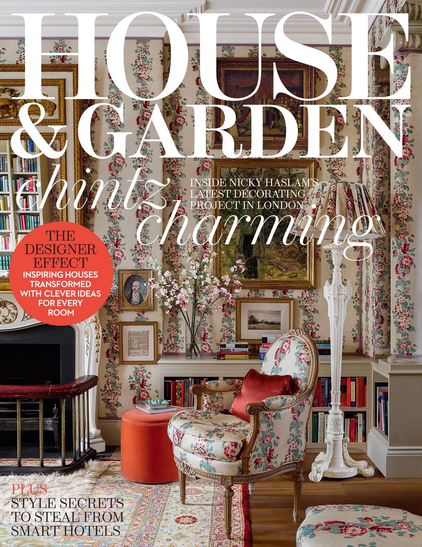
This month, my Freshly Cut Flowers sculptures were featured in House & Garden magazine. They were part of a feature called ‘Petal Power’ showing floral interior designs, styled beautifully by Rémy Mishon.
![]()
![]()
〰〰〰〰〰〰〰〰〰
This month, my Freshly Cut Flowers sculptures were featured in House & Garden magazine. They were part of a feature called ‘Petal Power’ showing floral interior designs, styled beautifully by Rémy Mishon.

〰〰〰〰〰〰〰〰〰
08.02.2021
Everpress: Visual artists to watch in 2021
Last month I was beyond flattered to be picked as one of Everpress’s visual artists to watch in 2021. You can read the article here. There are lots of other interesting artists on the list - one of my favourites being Alice Kelly who pushes the weaving trend of 2021 to the next level.
![]()
![]()
Of course, as Everpress are THE champions of t-shirts I have launched a campaign with them. It is called Spring Greens, available in both short and long sleeves. For all the romantics like me, here is the blurb:
“The days are getting longer and all the leaves haves fallen from the trees - the only way is up! Not long until spring is around the corner and this tee is just the garment to get you in the mood for greener days ahead! The past year I have spent so much time looking out of my window watching the big tree outside my flat change drastically across the seasons. I know that when the first green sprouts will start to emerge on the branches, it’s a sign of better days ahead. Days spent swimming in the canals, dancing outdoors and cycling in the sunshine!”
![]()
![]()
Available until 17th February.
Shop Spring Greens here.
〰〰〰〰〰〰〰〰〰


Of course, as Everpress are THE champions of t-shirts I have launched a campaign with them. It is called Spring Greens, available in both short and long sleeves. For all the romantics like me, here is the blurb:
“The days are getting longer and all the leaves haves fallen from the trees - the only way is up! Not long until spring is around the corner and this tee is just the garment to get you in the mood for greener days ahead! The past year I have spent so much time looking out of my window watching the big tree outside my flat change drastically across the seasons. I know that when the first green sprouts will start to emerge on the branches, it’s a sign of better days ahead. Days spent swimming in the canals, dancing outdoors and cycling in the sunshine!”

Available until 17th February.
Shop Spring Greens here.
〰〰〰〰〰〰〰〰〰
21.01.2021
Altijd hongerig — Always hungry
Some people follow their hearts but I unapologetically follow my stomach. As a child I would ask my mum what was for dinner whilst eating my breakfast; no wonder she says I always think at least two meals ahead. And to this day food is one of my predominate thoughts, motivators and pleasures in life.
I could write an essay on the complex relationship I have to food being a female or the moral decisions we make with our supermarket choices. But instead I have chosen to stick to a territory I feel familiar with and well versed in… random cool things I found online! Below is a round up of my top five foodie finds:
These non-edible ornaments are brilliant - I didn’t know that a beaded orange was what my life was missing, until I set eyes on these! Not only are they fabulous coffee table decorations but Pura Utz make it their mission to ensure that the Mayan women in Guatemala they hire are paid accordingly for their immaculate craft skills. Giving them sufficient pay to be able to take care of themselves properly and plan for their futures. No junk or mass produced food here, only thoughtfully crafted one off objects.
![]()
![]()
![]()
![]()
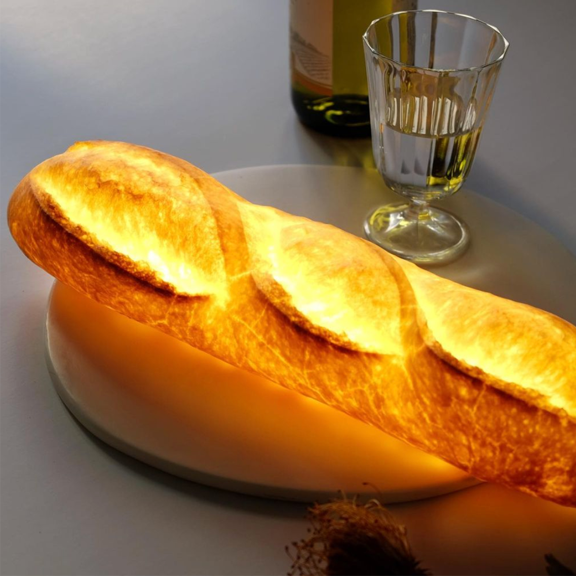
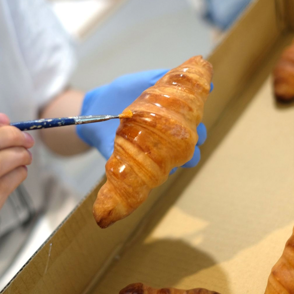
Yukiko Morita is the brains behind Pampshade. After working in a bakery for many years, she “wanted many people to experience the inviting charm of bread” and these beautiful, baked goods she has created do just that. Each lamp is unique and made using real bread (loaves which would have been thrown away at the end of the day) combined with the wizardry of Morita’s artist skills. In a world where it feels that carbs often can’t catch a break, it is such a delight to see these glowing croissants and baguettes - good enough to eat!
![]()
![]()
![]()
![]()
A foodie can spot another foodie from far off and Cecilia most definitely is one! She is the brains behind Plate Talks a website which combines recipes, travel and food related chat - all in the most excellent taste too. During the first lockdown Still Here Still Life (an Instagram-based drawing platform) teamed up with Plate Talks; Cecilia doing live cook alongs on IGTV and the final meal becoming the illustration brief for the next seven days. I love the concept so much and it’s a fun drawing task too! I’ve never had the courage to post my sketches online but would highly recommend it as a source of drawing inspiration and a delicious way to get more talented, young illustrators on your radar too.
![]()
Here is my order of preference when it comes to food: eating food, preparing food, talking about food and lastly reading about food. Books like Eat up, Toast and Heartburn bring such joy and comfort to me, discovering writers who put into words perfectly my obsession with all the rituals around eating. This collection of essays has a similar stance to food as those three books I previously listed - food is a way to love. It can be used to seduce, comfort, steal, smother - like many of the essayists in In the Kitchen the relationships in my life are remembered by certain meals and particular recipes. This book was very easy to read with the likes of Rachel Roddy and Ruby Tandoh submitting entries. However my one criticism of the book is that it had a predominately female view on the kitchen, I would love to hear more stories of how the other sex deal with food and if it is loaded with an equal measure of emotion for them.
![]()
![]()
![]()
![]()
This one is one we all know and love already! But I thought it would be rude not to mention Nicole McLaughlin’s artworks. Her simple, playful ideas are always executed immaculately - no wonder she has such a huge, adoring following and a star studded list of brands wanting her spin on their products.
That’s all for now!
Bon appetit / Eet smakelijk / Enjoy your tea!
〰〰〰〰〰〰〰〰〰
I could write an essay on the complex relationship I have to food being a female or the moral decisions we make with our supermarket choices. But instead I have chosen to stick to a territory I feel familiar with and well versed in… random cool things I found online! Below is a round up of my top five foodie finds:
![]()
![]()
![]()
![]() Photography from purautz.com
Photography from purautz.com
#1 - Pura Utz’s beaded fruit

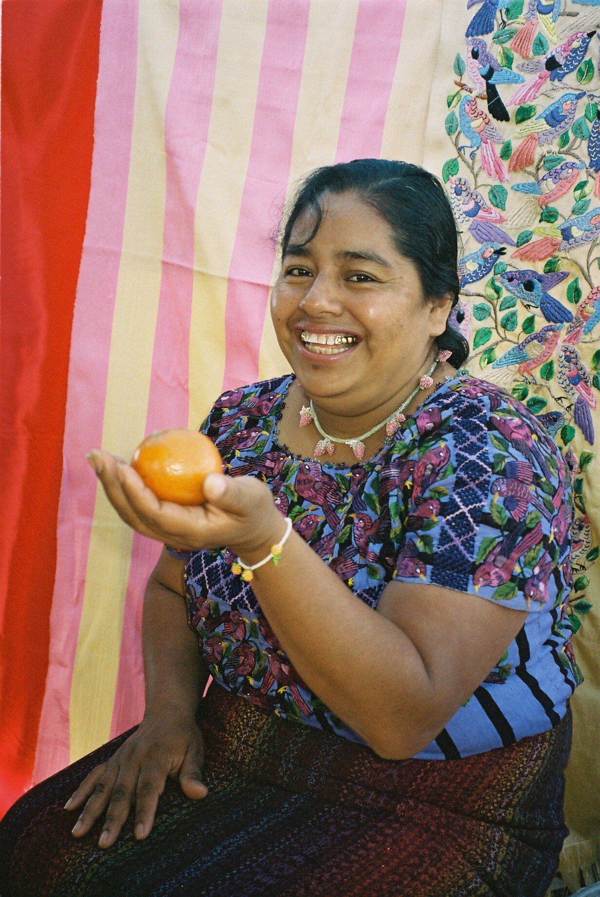
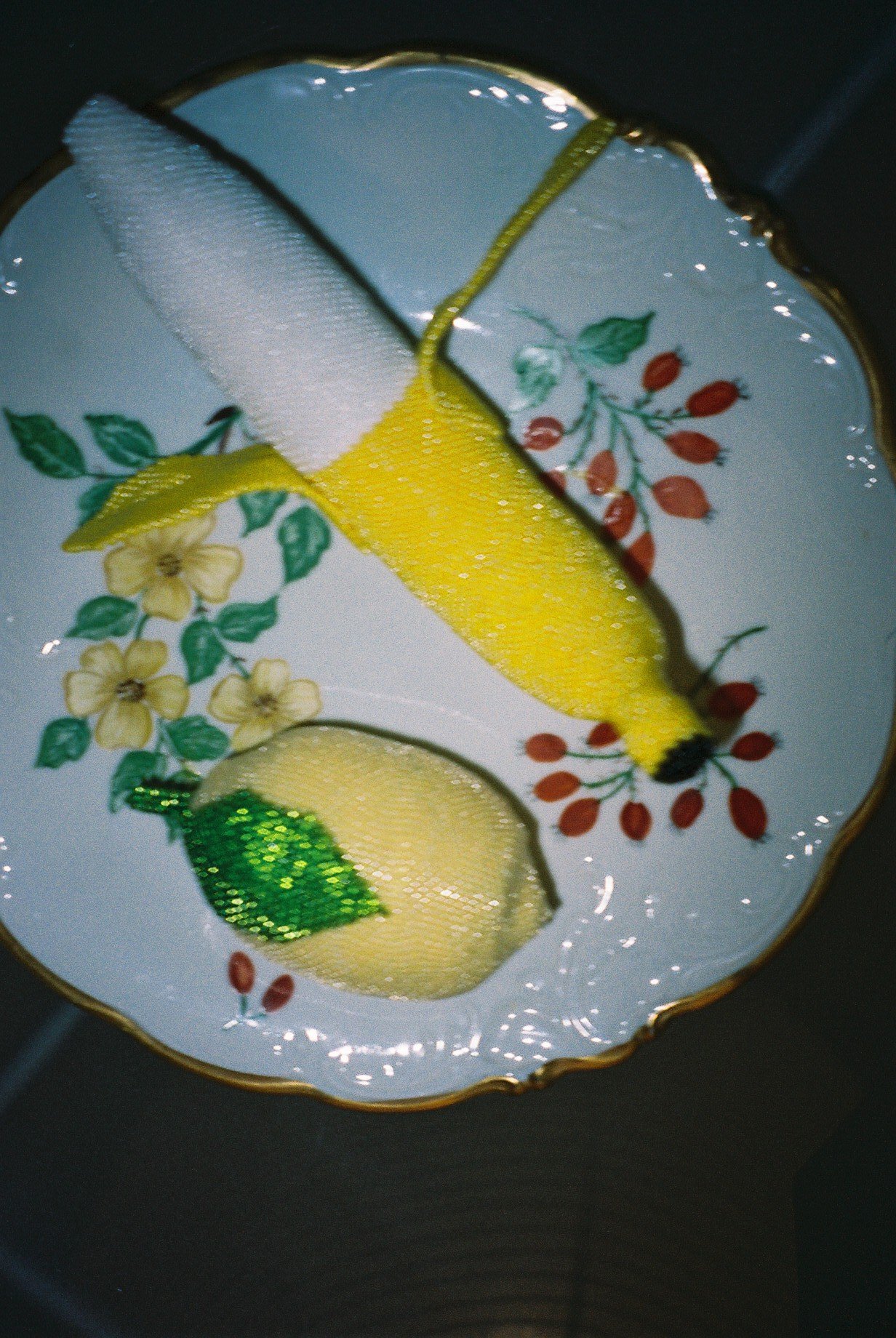

These non-edible ornaments are brilliant - I didn’t know that a beaded orange was what my life was missing, until I set eyes on these! Not only are they fabulous coffee table decorations but Pura Utz make it their mission to ensure that the Mayan women in Guatemala they hire are paid accordingly for their immaculate craft skills. Giving them sufficient pay to be able to take care of themselves properly and plan for their futures. No junk or mass produced food here, only thoughtfully crafted one off objects.


Photography from @pampshade
#2 - Pampshade
Photography from @pampshade
Yukiko Morita is the brains behind Pampshade. After working in a bakery for many years, she “wanted many people to experience the inviting charm of bread” and these beautiful, baked goods she has created do just that. Each lamp is unique and made using real bread (loaves which would have been thrown away at the end of the day) combined with the wizardry of Morita’s artist skills. In a world where it feels that carbs often can’t catch a break, it is such a delight to see these glowing croissants and baguettes - good enough to eat!


From left to right: Cecilia’s pink pasta with beetroot & dill, Anna Boulogne, Julia Syrzistie & Charlotte Bowie
#3 - Plate Talks x Still Here Still Life
A foodie can spot another foodie from far off and Cecilia most definitely is one! She is the brains behind Plate Talks a website which combines recipes, travel and food related chat - all in the most excellent taste too. During the first lockdown Still Here Still Life (an Instagram-based drawing platform) teamed up with Plate Talks; Cecilia doing live cook alongs on IGTV and the final meal becoming the illustration brief for the next seven days. I love the concept so much and it’s a fun drawing task too! I’ve never had the courage to post my sketches online but would highly recommend it as a source of drawing inspiration and a delicious way to get more talented, young illustrators on your radar too.
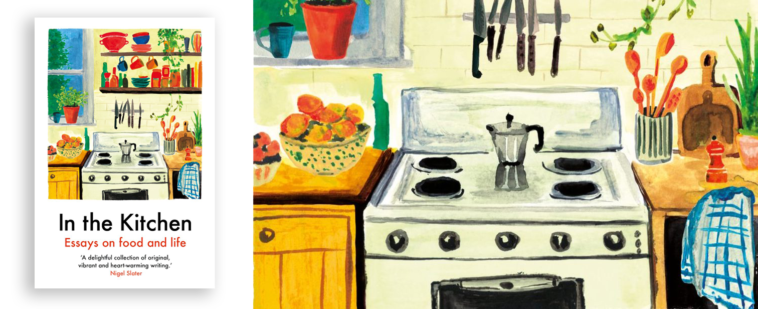
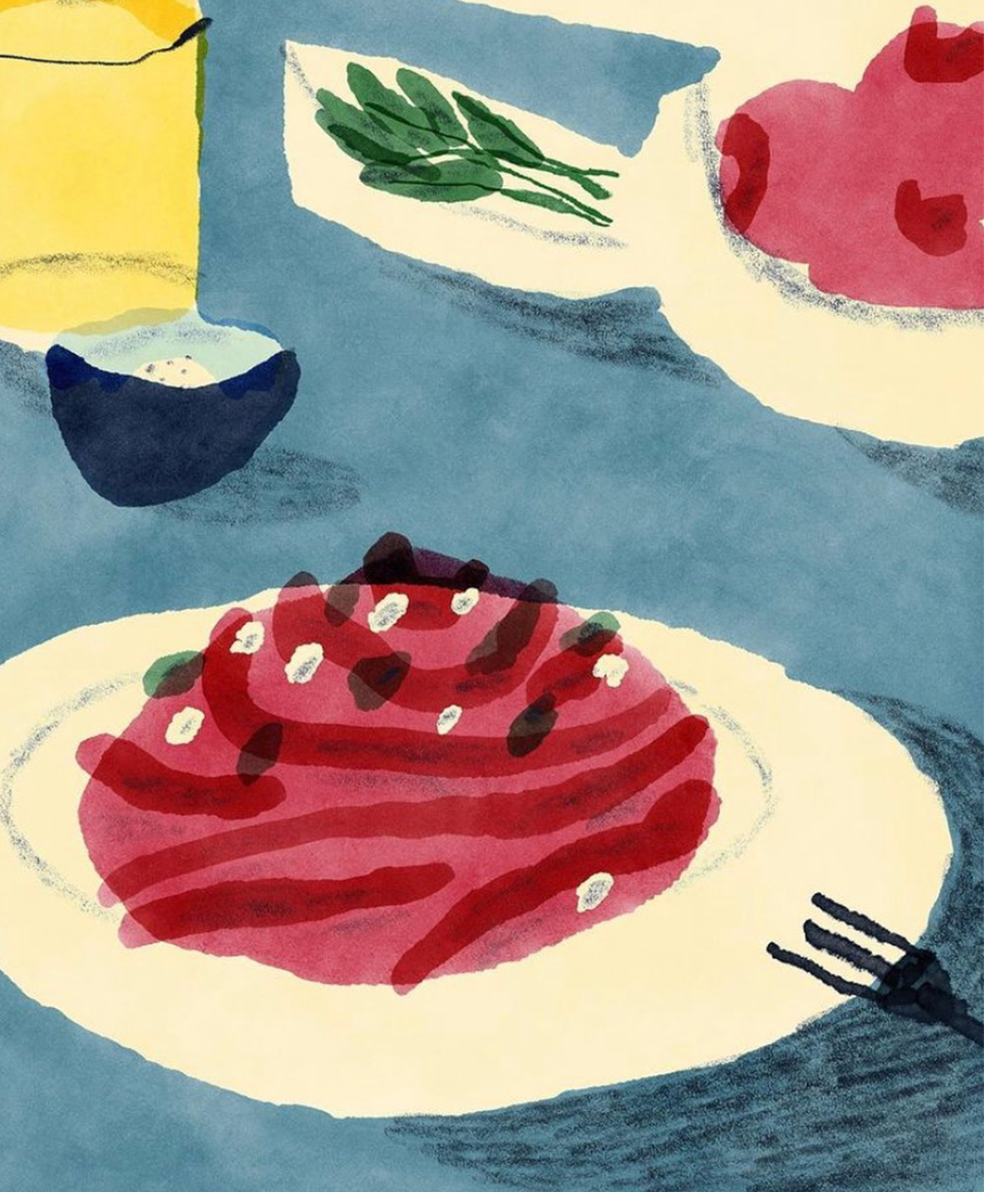
In the Kitchen, published by Daunt Books
#4 - In the Kitchen: Essays on Food and Life
Here is my order of preference when it comes to food: eating food, preparing food, talking about food and lastly reading about food. Books like Eat up, Toast and Heartburn bring such joy and comfort to me, discovering writers who put into words perfectly my obsession with all the rituals around eating. This collection of essays has a similar stance to food as those three books I previously listed - food is a way to love. It can be used to seduce, comfort, steal, smother - like many of the essayists in In the Kitchen the relationships in my life are remembered by certain meals and particular recipes. This book was very easy to read with the likes of Rachel Roddy and Ruby Tandoh submitting entries. However my one criticism of the book is that it had a predominately female view on the kitchen, I would love to hear more stories of how the other sex deal with food and if it is loaded with an equal measure of emotion for them.


Photography from @nicolemclaughlin
#5 - Nicole McLaughlin’s art
This one is one we all know and love already! But I thought it would be rude not to mention Nicole McLaughlin’s artworks. Her simple, playful ideas are always executed immaculately - no wonder she has such a huge, adoring following and a star studded list of brands wanting her spin on their products.
That’s all for now!
Bon appetit / Eet smakelijk / Enjoy your tea!
〰〰〰〰〰〰〰〰〰
11.12.2020
Diary
For some time now I have wanted to add this section to my website. I have always loved documenting my process, inspirations and BTS online, whether on Blogspot (back in the day!) or Instagram - I’m truly a sucker for the internet and sharing creativity! Recently I have found Instagram very uninspiring and not that great for my mental health either; hence why I’m getting a bit old school and starting a ‘diary’ on this very page you are reading.
In terms of the type of content, I’m going to go with the flow and not set too many rules about what will live here and frequency.
In terms of the type of content, I’m going to go with the flow and not set too many rules about what will live here and frequency.
In this entry I want to talk about a book I thoroughly enjoyed reading back in October: Ways of Curating by Hans Ulrich Obrist. It’s one of those seductive looking Penguin Classics, which you normally see at the counter of the Tate gift shop that oddly I never bought, until earlier this year.
Of course I vaguely knew who Hans Ulrich Obrist because of his strong link to the Serpentine Gallery and weirdly what he looks like too! And in this book I found it interesting to read how he considers himself purely a curator, not a curator/artist which is a job title I hear thrown around a lot. In a world of multi-hyphenated creatives his singularity in what he does was refreshing to learn about.
“I don’t believe in the creativity of the curator. I don’t think that the exhibition-maker has brilliant ideas around which the works of artists must fit. Instead, the process always starts with a conversation, in which I ask the artists what their unrealized projects are, and then the task is to find the means to realize them. At our first meeting, Boetti said curating could be about making impossible things possible.”
This notion of unrealised projects really struck a cord with me. I find as a creative/artist so often I am defined by my existing portfolio and the work I have already made - asked to do remakes of existing projects. This way that Hans speaks to artists is something that I wish to bring to future conversations I have and also how I would like to be spoken too. ‘Making impossible things possible’ is a fantastic attitude to have. In a world where projects are often discussed in terms of limitations (eg: time, budget, laws of gravity) we are often setting ourselves up to fail with this negative speak. This impossible/possible mentality is, in my opinion, responsible to the success and originality of his exhibitions.
The do it exhibition series curated by Hans Ulrich Obrist is an open exhibition model, consisting of instructions written by the artists to be carried out at the venue of the show. No physical matter is sent to the gallery from the artist but the following of their instructions become the artworks themselves. Which naturally will vary from location to location and of course the individual who carries out the ‘performances’. I have always been a huge fan of DIY and this format invented by Hans makes my heart sing. It is so simple and our imaginations are put to work; rather than standing vacantly in front of paintings and staring for a time that feels socially acceptable our minds are put to work. Also the focus of the exhibition shifts from ‘is this good?’ to ‘what exactly is this?’, which I think is a far more interesting discussion to have.
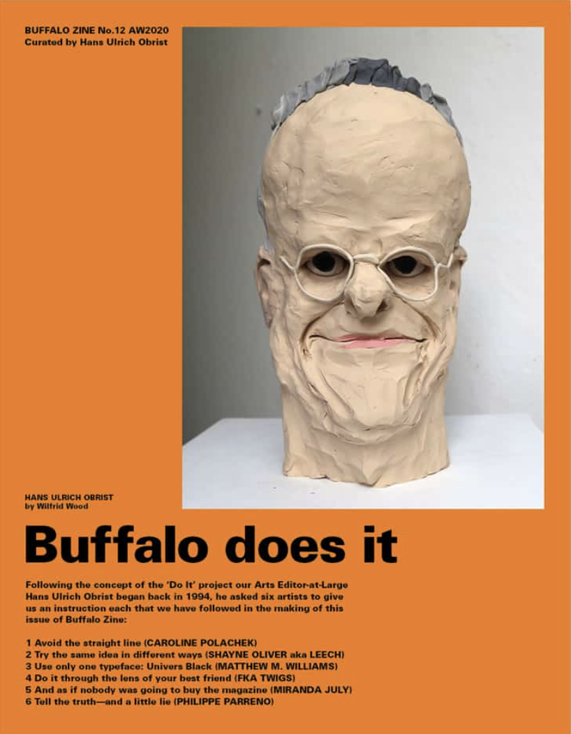
Funnily enough, whilst scrolling through Instagram after reading this book I saw that Buffalo Zine’s latest issue is ‘Buffalo does it’ edited by none other than Hans Ulrich Obrist. What better time to set artists tasks to do than now, when we are trapped at home due to our local COVID regulations. Being told what to do, in a time when we have no idea what to do - perfect! I can’t wait to get my hands on a copy, it wasn’t available at my local magazine shop (who are excellent stockists usually) so I will order online instead. Will report back.
Back to ‘Ways of Curating’ - I highly recommend it for anyone who enjoys setting foot in a gallery. Personally it inspired me to be more collaborative when working with others, have more meaningful conversations (note to self: don’t be afraid to initiate conversation with strangers or arranging studio visits on my travels) and to not let limitations restrict my work. In a world that feels more segregated than ever (especially as the Brexit deadline looms) I will leave you these words from the book, as a parting thought …
“Regions and continents are even more so [outdated], and it’s very important to acknowledge that we’re living in a transnational moment. It seemed important to go beyond national boundaries and focus instead on cities – because the driving force of the 1990s was really these urban mutations.”
References: Ways of Curating, do it & Buffalo Zine
Of course I vaguely knew who Hans Ulrich Obrist because of his strong link to the Serpentine Gallery and weirdly what he looks like too! And in this book I found it interesting to read how he considers himself purely a curator, not a curator/artist which is a job title I hear thrown around a lot. In a world of multi-hyphenated creatives his singularity in what he does was refreshing to learn about.
“I don’t believe in the creativity of the curator. I don’t think that the exhibition-maker has brilliant ideas around which the works of artists must fit. Instead, the process always starts with a conversation, in which I ask the artists what their unrealized projects are, and then the task is to find the means to realize them. At our first meeting, Boetti said curating could be about making impossible things possible.”
This notion of unrealised projects really struck a cord with me. I find as a creative/artist so often I am defined by my existing portfolio and the work I have already made - asked to do remakes of existing projects. This way that Hans speaks to artists is something that I wish to bring to future conversations I have and also how I would like to be spoken too. ‘Making impossible things possible’ is a fantastic attitude to have. In a world where projects are often discussed in terms of limitations (eg: time, budget, laws of gravity) we are often setting ourselves up to fail with this negative speak. This impossible/possible mentality is, in my opinion, responsible to the success and originality of his exhibitions.
The do it exhibition series curated by Hans Ulrich Obrist is an open exhibition model, consisting of instructions written by the artists to be carried out at the venue of the show. No physical matter is sent to the gallery from the artist but the following of their instructions become the artworks themselves. Which naturally will vary from location to location and of course the individual who carries out the ‘performances’. I have always been a huge fan of DIY and this format invented by Hans makes my heart sing. It is so simple and our imaginations are put to work; rather than standing vacantly in front of paintings and staring for a time that feels socially acceptable our minds are put to work. Also the focus of the exhibition shifts from ‘is this good?’ to ‘what exactly is this?’, which I think is a far more interesting discussion to have.
Funnily enough, whilst scrolling through Instagram after reading this book I saw that Buffalo Zine’s latest issue is ‘Buffalo does it’ edited by none other than Hans Ulrich Obrist. What better time to set artists tasks to do than now, when we are trapped at home due to our local COVID regulations. Being told what to do, in a time when we have no idea what to do - perfect! I can’t wait to get my hands on a copy, it wasn’t available at my local magazine shop (who are excellent stockists usually) so I will order online instead. Will report back.
Back to ‘Ways of Curating’ - I highly recommend it for anyone who enjoys setting foot in a gallery. Personally it inspired me to be more collaborative when working with others, have more meaningful conversations (note to self: don’t be afraid to initiate conversation with strangers or arranging studio visits on my travels) and to not let limitations restrict my work. In a world that feels more segregated than ever (especially as the Brexit deadline looms) I will leave you these words from the book, as a parting thought …
“Regions and continents are even more so [outdated], and it’s very important to acknowledge that we’re living in a transnational moment. It seemed important to go beyond national boundaries and focus instead on cities – because the driving force of the 1990s was really these urban mutations.”
References: Ways of Curating, do it & Buffalo Zine